We are talking about a brand that is very well-known in Hungary — and far beyond its borders as well.
Adrián Balla
Senior Consultant, Virgo
There are clients you have to explain, and there are those whose names speak for themselves. RTL clearly belongs to the latter category.
We are talking about a brand that is very well-known in Hungary — and far beyond its borders as well.
Working with a brand like this is both a privilege and a responsibility. Its digital presence is not merely a communication channel but a business-critical infrastructure: news sites, mobile applications, VOD platforms, live voting solutions, and advertising systems together form an ecosystem that serves hundreds of thousands of users daily — and, at peak moments, even several million.
People ask where you work. At Virgo. That doesn’t really mean much to them. Then you start listing it: we are the ones developing RTL, yes, the voting system too, and rtl.hu, and the app as well — and then they get it.
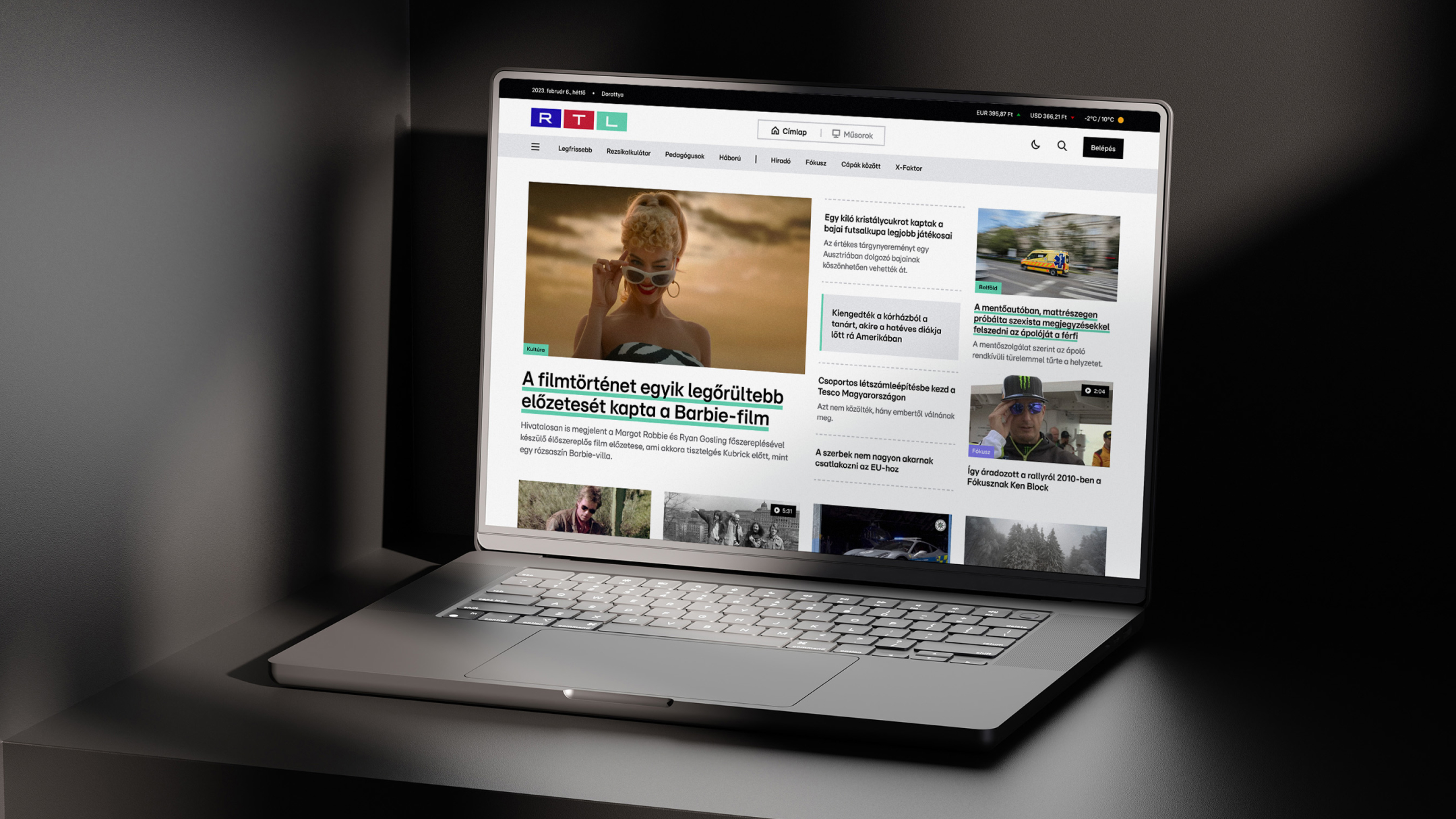
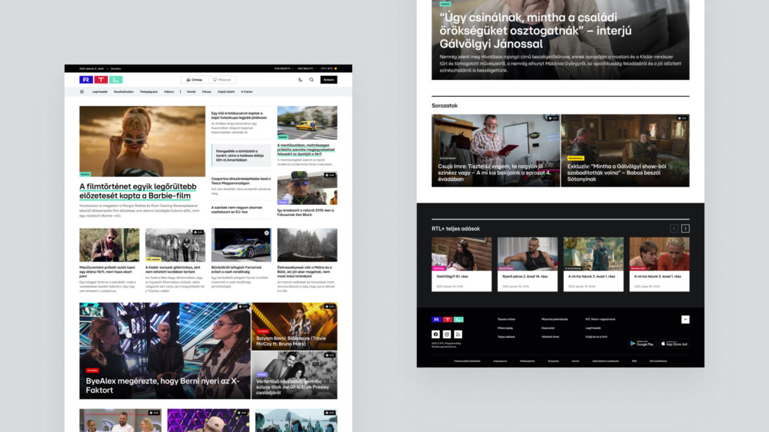
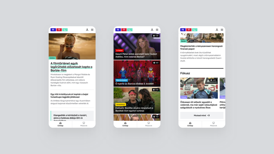
When Virgo won the tender in 2019 to redesign rtl.hu, it was clear from the very beginning that this would not be a classic redesign project. The task was to transform a live, business-critical system used on a daily basis, on tight deadlines and within an existing infrastructure. Although the brief primarily focused on design and frontend renewal, Virgo already approached the project as a brownfield development. The solutions had to fit into the existing system while remaining scalable and maintainable in the long term.
During the first project, the goal was to redesign rtl.hu, a platform built around a video-first mindset. In the second project, we were tasked with renewing the site’s functionality as well — basically, Virgo was asked to create a full-scale news site.
At first, they wanted to create a video-first website, sort of a cross between YouTube and a news site (…) so they would actually have a purpose for the platform, rather than just having a website simply because RTL needs one.
Virgo’s task extended far beyond refreshing the visual appearance. The team was responsible for designing the entire UX/UI concept as well as delivering both frontend and backend development, ensuring optimal performance across web and mobile platforms alike.
The greatest challenge was the integration of various content types. The platform had to simultaneously accommodate live TV broadcasts, show-videos and text-based news, while ensuring a unified and coherent user experience. We needed to develop UX solutions that supported the editorial team’s new operating model and ensured stable performance even under heavy traffic.
All of this took place during a period when, prior to the rebranding, the site had to remain recognizable and usable with temporary visual elements in place, while the forward-looking concept had already been defined.
Virgo began the work with UX research to uncover editorial, business, and user needs. In-depth interviews were conducted with leaders from various areas of RTL to understand the future model of content creation, monetization expectations, and operational challenges.
Mapping user journeys helped reveal how visitors navigate the site, what types of content they consume, and where it makes sense to encourage further content consumption. The homepage, the article pages, and the show pages went through multiple iterations, with continuous alignment with the RTL team to harmonize business, editorial, and technological considerations.
The visual concept was built on a long-term, sustainable, and extensible design system. The work started with mood boards and the definition of visual directions, resulting in a UI direction that paved the way for the rebranding, while temporary visual elements ensured recognizability during the transition period.
The design system provided a unified approach to colors, typography, grids, and components, laying the foundation for future platform expansions and adaptation to other digital surfaces.


Virgo built a modern, Vue.js 3–based single-page application with server-side rendering to ensure SEO and performance. Dynamic content was delivered via REST APIs, and the system was integrated with external authentication and push notification solutions. The development approach was cross-platform, enabling web and mobile applications to be developed in parallel in a cost-efficient manner.
Following the successful launch, the collaboration quickly expanded. More and more tenders followed, now affecting not only the website but the entire digital presence: reimagining design systems, developing the news portal, mobile applications, VOD-related solutions, and campaign sites.
In the meantime, a completely custom homepage editor was created behind rtl.hu, integrated directly into the existing CMS. This tool allowed editors a high degree of freedom in shaping the homepage, while the technical framework ensured consistency and stability.
The editors were given a tool with which they could solve almost anything on the homepage.
The collaboration did not operate on a project-by-project basis but through continuous support. New needs, new content and business goals emerged, to which Virgo responded quickly and as a partner. During this period, Virgo’s role went far beyond classic development tasks. The team maintained a constant presence: supporting, maintaining, and thinking together with RTL’s digital team about new requirements, business objectives, and content directions.
One of the biggest challenges of the collaboration was the digital voting systems connected to live shows. Voting for X-Factor and other entertainment programmes generated traffic spikes that are difficult to prepare for using traditional planning methods. As a result, the mobile application and voting system associated with X-Factor was not only a development challenge but also an operational one.
What surprised me the most is how much power TV still holds today. When the host says live on air that everyone should take out their phones and go to the RTL mobile app, and suddenly ten thousand users arrive — that’s not easy to handle.
Scalability, stability, and the legal environment (studio, notary, live production) all came into play at the same time. Virgo’s team was present at RTL’s headquarters during live broadcasts, working closely with operations and production teams. The first live vote that ran stably was a major milestone: confirmation that the architecture, operations, and collaboration all performed well in a live environment.

The RTL-project was a defining milestone for Virgo from an internal perspective as well. This was where the operating model truly matured — one in which design and development are not sequential steps but parts of a single, shared thinking process.
We were literally sitting next to each other: while designing, we were already thinking about how it would be developed — and vice versa.
Component-based design, shared prototyping, and immediate technical feedback made it possible for planned solutions to take development, maintenance, and scalability considerations into account from the very moment they were created.
We knew that what we designed, we would also be able to develop.
This confidence defined the project from start to finish and later became one of Virgo’s core strengths in other collaborations as well.
They trust us with new projects, new technologies, and new requirements they want to realize — that is very clear feedback for me.
Over the years, the relationship gradually evolved from a client–vendor setup into a genuine partnership. New projects, shared decisions, and mutual trust all reinforced this transformation. Trust was built step by step, but at a certain point it became clear:
Changes in scope, tight deadlines, and the need to align the interests of many stakeholders at RTL did not become sources of conflict, but shared challenges. The challenges did not disappear, they became manageable through open communication, joint decision-making, and sometimes even informal conversations. The focus was always on maintaining balance between business goals, content, and user experience.
The RTL-project became more than just a key reference for Virgo. It served as a milestone for the company’s evolution. It reinforced the strategic role of design and the integrated operation of design and development, helping Virgo position itself not merely as a development shop, but as a provider of complex digital solutions. The methodologies developed during this collaboration — especially the close cooperation between design and development — have continued to shape the company’s operations ever since. As the team put it: they grew not only professionally but also became more adaptable on a personal level.

The shared story of Virgo and RTL clearly demonstrates how a successful tender can evolve into a long-term digital partnership. This collaboration is not the story of a closed project, but that of a continuously evolving digital ecosystem that simultaneously shapes the operations of a nationwide media brand and the professional identity of a digital agency. The story highlights that digital success is not only about technology, but also about trust, shared thinking, and adapting together to challenges.

Sometimes a parcel simply disappears.
Not because it’s stolen – but because the label gets damaged, the address smudges, or it just slips behind the courier’s seat. With tens of thousands of parcels moving through DPD every single day, the occasional “mystery package” is inevitable.
The real question is: how do you find it and get it back to the right person?
Back in the day, this was all handled manually in Excel – with paper forms, digital camera photos, and endless file uploads. If the customer service rep was lucky, they’d eventually find the right parcel in a spreadsheet. If not… well, that package’s fate was sealed.
That’s when DPD decided it was time for a better, scalable, and internationally adaptable solution. They partnered up with Virgo, and the result was Lost & Found — a fully digital system that not only streamlined the process but boosted the success rate of recovered parcels to 90%.
In the new system, every unidentified parcel is logged and processed digitally — with photos, metadata, and automated tracking.
When a customer calls, the service team can instantly access the database, while couriers or hub workers upload photos of the package. Image recognition algorithms read the labels and automatically match them to the customer’s reported issue. At the end of the workflow, all reports are generated automatically – up-to-date, accurate, and fully digital.
What used to be a time-consuming manual hunt is now a transparent, searchable, and automated process.
Data is easy to track, photos are organized, and reporting is just a click away. The result? Faster, smoother, and far more reliable case handling.

The challenge? Deliver a working product in record time – in a fast-changing business environment. Virgo’s strength was its ability to quickly assemble an agile, senior-level development team led by a Scrum Master, ready to adapt to shifting priorities on the go.
To make it work, Virgo restructured internal resources to build the perfect team for DPD.
From UX/UI design to front-end, back-end, and system integration – Virgo covered the full spectrum. This wasn’t about “selling people”; it was about building a true partnership that would create long-term value.
DPD had a clear business need, and they chose Virgo for the integration work. We had to pull together a team of senior experts who wouldn’t panic when business priorities shifted mid-project. It took some careful organization, but the result speaks for itself.

One key aspect of the Lost & Found project was that Virgo didn’t just deliver a product – it provided development capacity. A complete team, with a Scrum Master at the helm, fully embedded into DPD’s internal operations.
This meant DPD didn’t have to waste time recruiting or onboarding – experienced developers jumped in and started producing results from day one. For Virgo, this wasn’t simple “resource lending.” These were dedicated professionals still rooted in Virgo’s supportive environment, motivated and aligned with the project vision.
The outcome? An integrated team model that allowed quick responses, agile decision-making, and a truly seamless collaboration. DPD’s requirement was clear: integrate external services into internal systems. Virgo’s job was to make it happen – fast, effectively, and at top technical quality.
Some companies just sell people. Virgo gave us colleagues who internalized the project’s vision. That’s a massive difference.
DPD’s biggest headache was the manual, Excel-based workflow – slow, error-prone, and impossible to scale internationally. They needed a digital system where lost parcels could be tracked across borders, with minimal human error and maximum efficiency.
Virgo built an integrated platform that combined photo-based data entry, text recognition, and automated reporting. The result: faster, more accurate, and far more transparent operations.
Customer service agents can now locate problematic parcels in seconds, while reports generate automatically – clean and error-free.
Virgo’s contribution covered everything from concept to launch.
Scrum Master Bea Őry also played a key role in stakeholder education – helping business-side partners understand agile principles in practice. Many admitted they learned a lot from the collaboration, and the regular sprint reviews gave them the visibility and predictability they needed.
The UX/UI design started with real user needs, ensuring the system was not just functional but comfortable and logical in daily use.
And when the project wrapped, Virgo stayed on board for maintenance and operation, ensuring long-term sustainability.
DPD received a modern, multi-layered system that delivered tangible business value. The responsive front-end enables fast, efficient work, while the back-end provides a secure backbone for data management and reporting. The design documentation ensures the platform remains scalable and user-centered for years to come.
Behind the scenes, robust infrastructure keeps the system reliable, always on, and ready to grow.

The biggest win?
90% of lost parcels now find their way home.
The old, error-prone manual processes were replaced with a sleek, automated digital system – saving time, reducing mistakes, and improving customer satisfaction across the board.
Customer service runs smoother, cross-border scalability is now reality, and the partnership between Virgo and DPD evolved into a strategic long-term collaboration, not just a one-off project.
I wouldn’t say it was carefree, but it was definitely an enjoyable journey into a world full of new challenges.
The Lost & Found project offers lessons for any organization. Manual, temporary solutions like Excel can only take you so far. At a certain scale, they simply can’t keep up. If a company hesitates to change, errors multiply and customer satisfaction plummets.
Agility wasn’t just a buzzword here – it was the key to success. Without fast adaptation to changing needs, the project would never have launched on time. Equally crucial was user experience: the system became truly valuable because people love using it.
Automation was another game-changer – freeing up time, reducing errors, and giving everyone more confidence in the process.
And perhaps the most important lesson: partnership.
Virgo wasn’t just a supplier; it was a strategic ally invested in DPD’s long-term success.
Both sides walked away richer in experience, knowledge, and trust – paving the way for future collaborations.
Beyond the great relationship we’ve built, these projects are also seriously challenging and technically exciting – high-standard, even a bit sexy, I’d say.
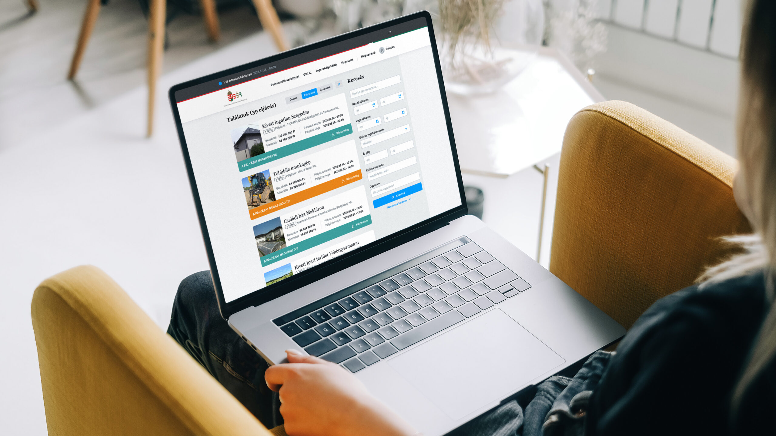
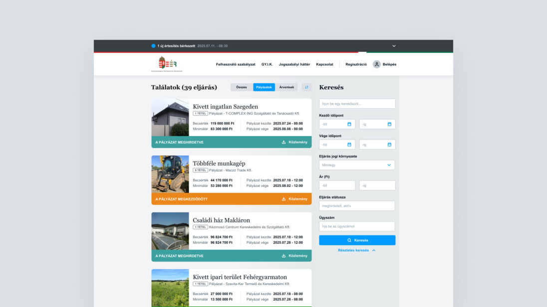
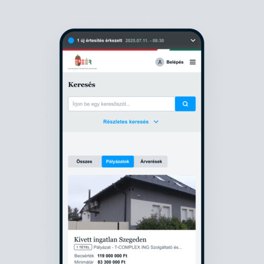
One of Virgo’s oldest projects, which we jokingly call the “State eBay,” was worked on remotely by our teams already 10 years ago – before it was cool. This project is none other than the creation of EÉR, the Elektronikus Értékesítési Rendszer (Electronic Sales System). We did not develop this project using conventional methods “by the book.” It had many unusual and interesting moments, which you can now learn more about in our case study – and maybe even take away some lessons.
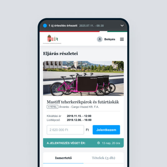
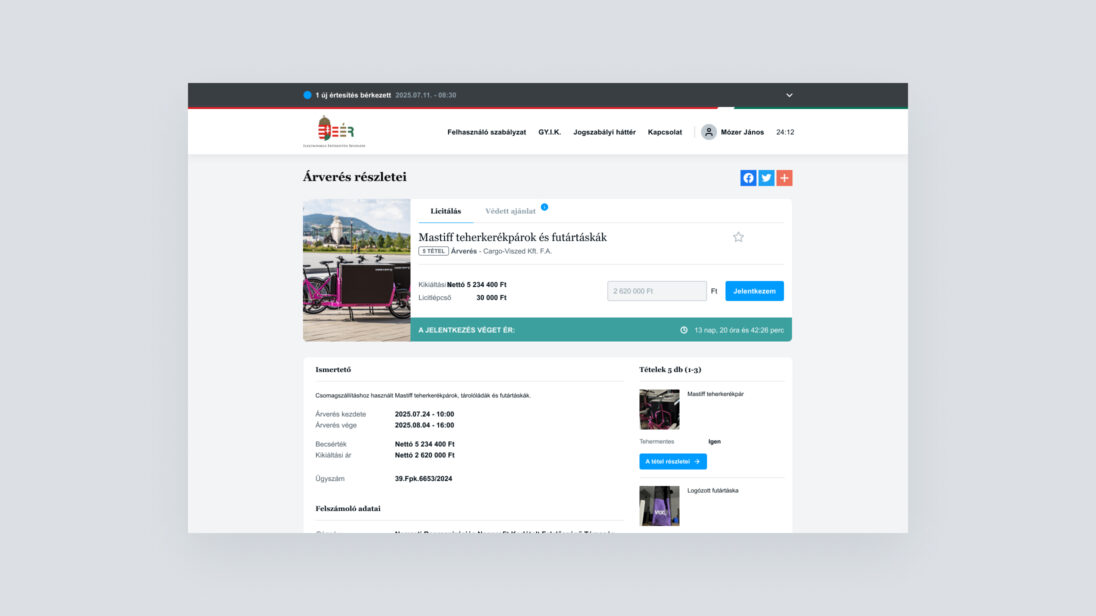
The Electronic Sales System (EÉR) is an online platform where the assets of companies under liquidation proceedings and non-profit organizations in Hungary are sold publicly. Sales take place via public tender or auction, announced by the liquidator or administrator responsible for the process.
In electronic sales, bidders (participants in tenders or auctions) may join personally, via a legal representative, or through an authorized agent. While anyone can view the EÉR platform, bidding (submitting tenders) is only possible after prior registration.
Virgo delivered the application in 2014, and it has been live since January 1, 2015. Since then, we have continuously supported the portal both operationally and at the application level.
The system was designed for integration with multiple external platforms, including payment and invoicing systems, the company registry, and the Liquidator Registry System (FNYR), which we also developed to assist the authority’s administrative work.
In recent years, we have carried out several modernization projects: replacing the old Vaadin frontend framework with Angular, and introducing a container-based platform for automated deployment, scaling, and management.
Due to its complexity, Virgo’s teams have been widely involved in the EÉR project. Version updates and continuous system monitoring are supported in full by our Operations (OAM) team.
Keeping the application up to date and meeting new requirements requires close collaboration between Back-end and Front-end developers, with designers also playing an active role in software planning. Our QA team ensures quality through testing new features and comprehensive regression tests before releases.
The entire workflow – from receiving client requirements to going live – is coordinated daily by our Project Managers.
Since the project began in 2014, Virgo has continuously carried out these tasks, meaning around 40–50 colleagues have left their mark on the product. We can safely say there are two types of people at Virgo: those who have already worked on EÉR, and those who eventually will!

Due to the short deadlines, there was no time for lengthy research. Instead, we co-created the application design with the client, working almost side by side, just two weeks ahead of the development team. We used A3 sheets and colored markers, focusing not on standard diagrams but on shared understanding.

A single drawing often contained both workflow steps and screen sketches, showing what data had to be collected at each step. These hand-drawn sketches became the basis for user stories for the two Scrum development teams.
EÉR consists of three distinct interfaces:
Since these serve very different user groups, we tailored our approach for each: on the public site, we drew inspiration from familiar platforms – webshops and auction sites – while complying with all regulations.
On the liquidator site, we realized that instead of designing a “wizard-style” solution, it was more effective to replicate the well-known paper and Word form templates liquidators had been using for years, enhanced with digital conveniences.

This worked so well that one of the first user requests after launch was to allow exporting procedures in PDF format. Users preferred generating official documents for the Hungarian Official Gazette (Magyar Közlöny) directly from EÉR rather than their old text editor workflow.
The two user-facing areas called for different technology choices – especially given the tight timeline.
For the public interface, we opted for a modern frontend stack: Node.js with Vue.js, ensuring a trendy, designer-friendly solution. This not only supported cutting-edge design but also motivated developers with a better Developer Experience, which was crucial under time pressure. We were among the first to deliver a Node.js-based solution in the Hungarian public sector – the initial audit was particularly challenging, but thanks to detailed documentation and cooperation with the operations team, we passed successfully.
For the liquidator and admin interfaces, functionality was the top priority. We used Vaadin, enabling back-end developers to deliver working UIs directly, which we then polished with minimal site-building work. Designers tailored the visuals to fit within Vaadin’s constraints, achieving cost-efficient yet user-friendly interfaces.
Over the years, the system has been modernized, and we gradually migrated everything to a unified Angular frontend.
EÉR was originally built (2014) on the Java EE stack, then considered the enterprise standard.
For the public frontend, we provided an API that was handled by a Node.js middleware layer, which offered performance optimizations and convenience features for frontend developers.
For the liquidator and admin sides, we relied on Vaadin-based UIs, as mentioned above.
The EÉR project successfully delivered a nationwide, regulation-compliant online marketplace, which since 2015 has reliably supported the sale of assets in liquidation procedures.
Virgo not only built the initial system but has been operating and continuously improving it ever since. The modernization steps – such as introducing Angular and containerized deployment – ensured scalability and long-term sustainability.
The system’s stable operation and continuous extensibility are clear proof of the project’s success and the client’s satisfaction.
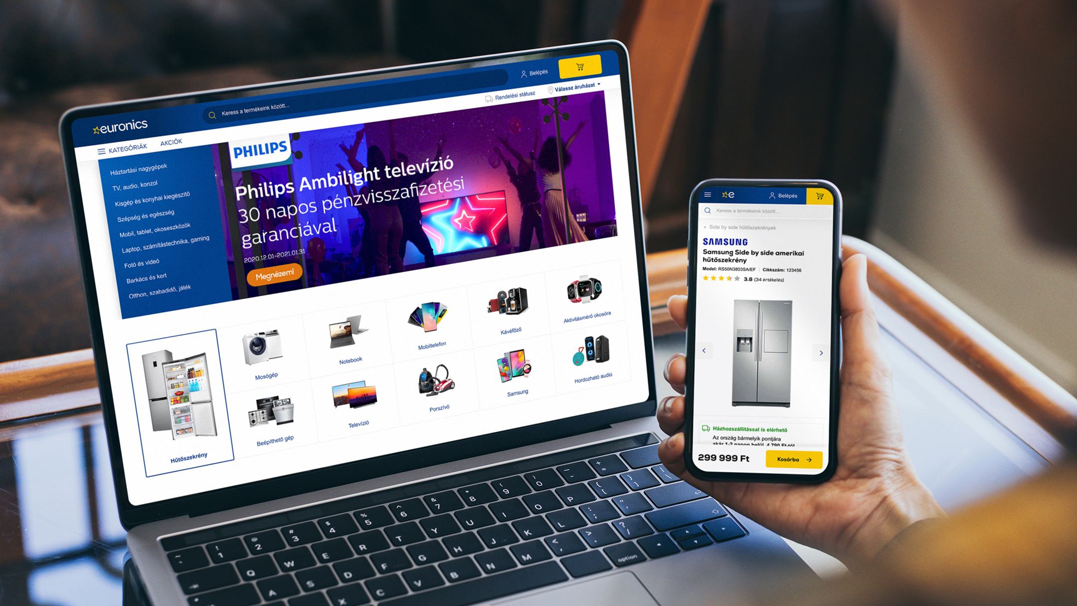
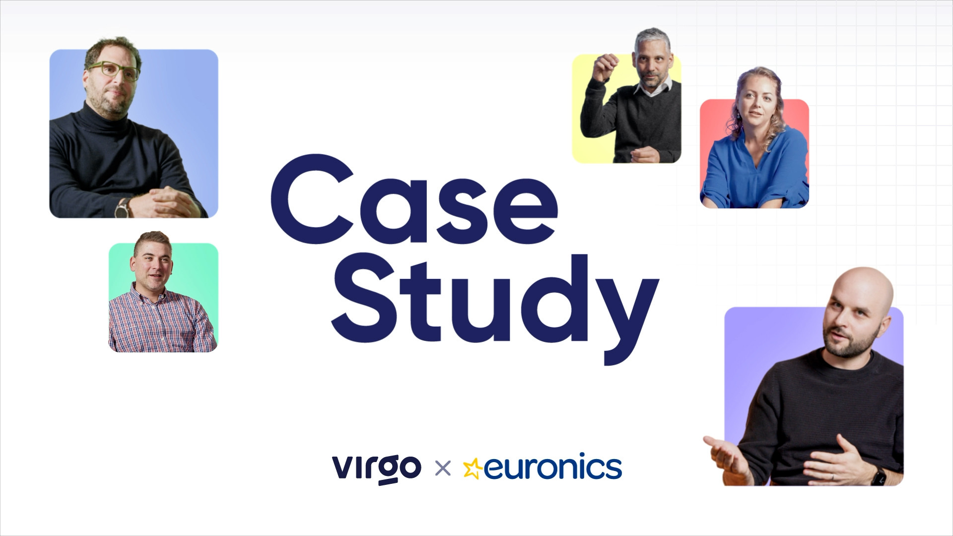
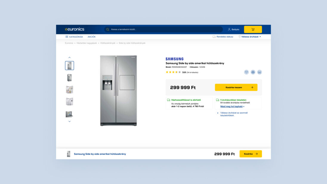
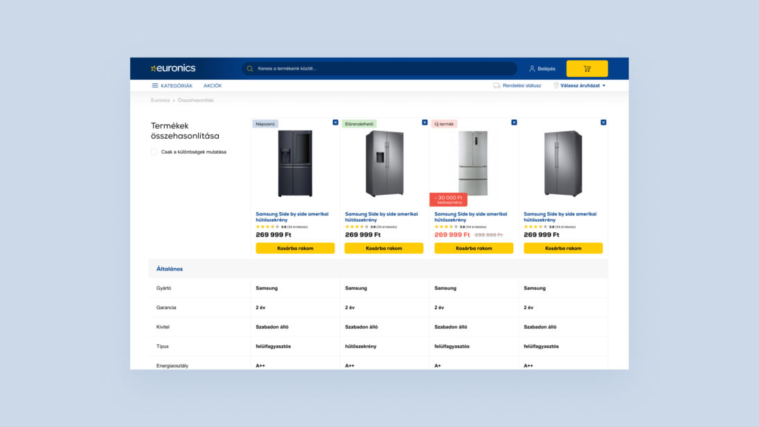
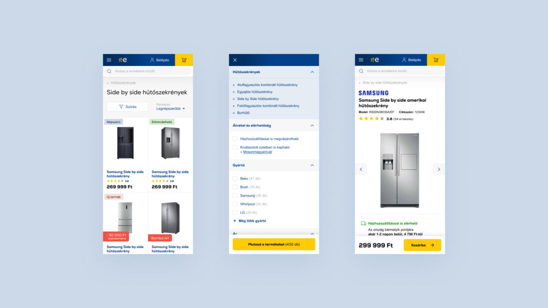
Euronics’ renewed webshop won the Grand Star at the HungarEcomm Stars 2024 Awards and, for the third year in a row, is the highest-grossing 100% Hungarian-owned e-commerce site. The large-scale project was led by Virgo, and we have plenty to share about it. Take a look behind the scenes of a true success story!
It was like replacing the engine of a speeding car — it took meticulous preparation, detailed planning, early-stage migration, and a seamless handover.

We began collaborating with the Euronics team in 2020 to develop their new webshop. Beyond technological upgrades, we completely redesigned the user experience and visual appearance. Our main objective was to increase webshop traffic, which we achieved using modern development tools, the implementation of new backend processes, and the creation of user journeys aimed at improving conversion rates.
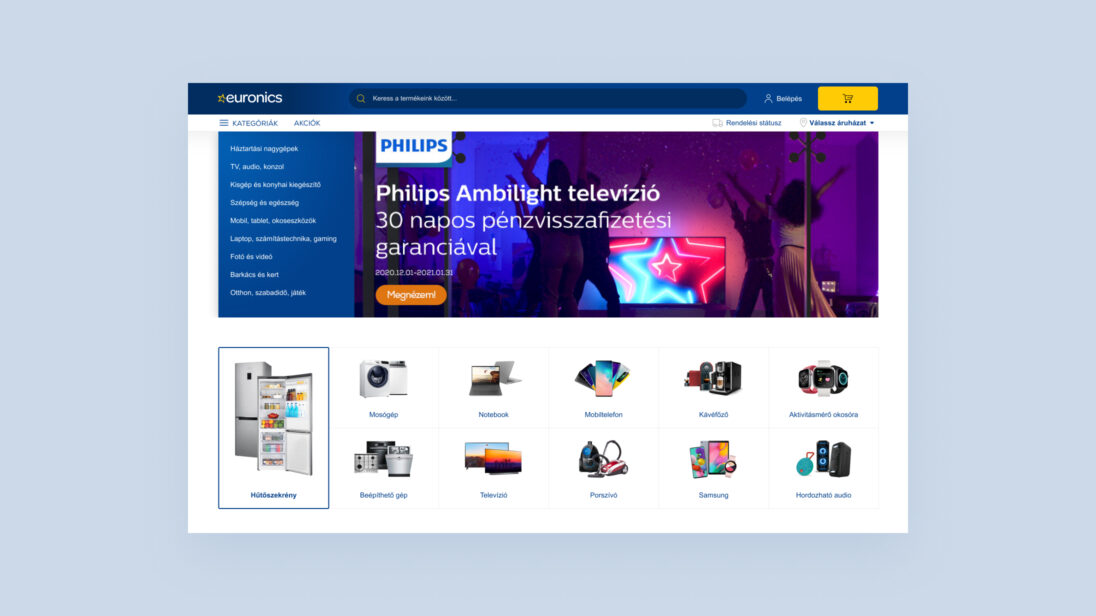
Redesigning the Euronics webshop came with several complex challenges. Our goal was to create a modern, user-friendly platform that not only provides an outstanding shopping experience but can also manage complex product categories and a catalogue of tens of thousands of products. We had to harmonize clarity, fast navigation, and visual appeal while ensuring the webshop worked smoothly across all devices. Responsive design, fast page loading, and the integration of both online and offline shopping needs were key to success.
From a technological standpoint, one of the biggest challenges was integrating both existing and new third-party systems and ensuring seamless data flow. We placed particular emphasis on establishing effective communication channels with various partners to identify bottlenecks and collaboratively develop targeted, long-term solutions.
Our team’s strength lies in our ability to quickly respond to changes, adapt flexibly to new situations, and ensure that no tasks “fall through the cracks.” We actively support the coordination of different departments and vendors, maintaining an end-to-end view of the process instead of focusing only on isolated programs or tasks. We strive for solutions that holistically support the client’s business goals.
Thanks to our market experience, we stay up to date with trends, understand the opportunities, pitfalls, and challenges. We don’t just deliver software—we stay by our clients’ side long term: operating, fine-tuning, and continuously improving systems to maximize their value. For us, success means establishing and maintaining stable, long-term partnerships with our clients.
We kicked off the project with thorough research to assess both client and user expectations and needs regarding the webshop.
The frontend was developed using a responsive approach, based on Bootstrap, using jQuery and Stencil.js.
In recent years, Euronics’ digital developments have not only brought technological advancements but also delivered tangible business results. Between 2018 and 2021, the share of online sales more than doubled, a growth further accelerated by the pandemic. Within just four years, the company moved from 12th to 6th place on the GKI Digital ranking of Hungary’s highest-grossing online retailers. In 2022, it was once again named the largest 100% Hungarian-owned online retailer.
At the heart of this success was a clear goal: to provide the best possible customer experience in the digital space. When redesigning the webshop, Euronics aligned its platform with the latest consumer trends. The search logic was restructured to help users find products and brand pages more efficiently.
The checkout process was streamlined, guest checkout was made seamless, and personalized product recommendations were further refined. Flexible delivery time slots were also introduced to better fit customers’ schedules.
Equally important was choosing a webshop engine capable of handling increasing traffic loads with speed and stability—ensuring smooth performance even during peak periods.
These achievements clearly demonstrate that when customer experience is prioritized, business success follows naturally. Euronics can be proud of the progress made and grateful to everyone who contributed to this outstanding project.
I ordered online — choosing and placing the order was super easy thanks to a really user-friendly interface. Delivery was fast, but unfortunately the product didn’t work out for me. That’s when it really helped that there was a store nearby where the return process was smooth and hassle-free.
I always buy my devices and gadgets here — it’s a no-brainer for me. The webshop works great: easy to search, order, and pay. The email notifications are clear and to the point, so I never have to worry about the status of my order. Plus, the prices are really good, especially considering they also have physical stores. There was even a time when I ordered something online, but happened to be near a store the next day — I popped in, they had it in stock, and I was able to pick it up right away. They were super flexible about it.
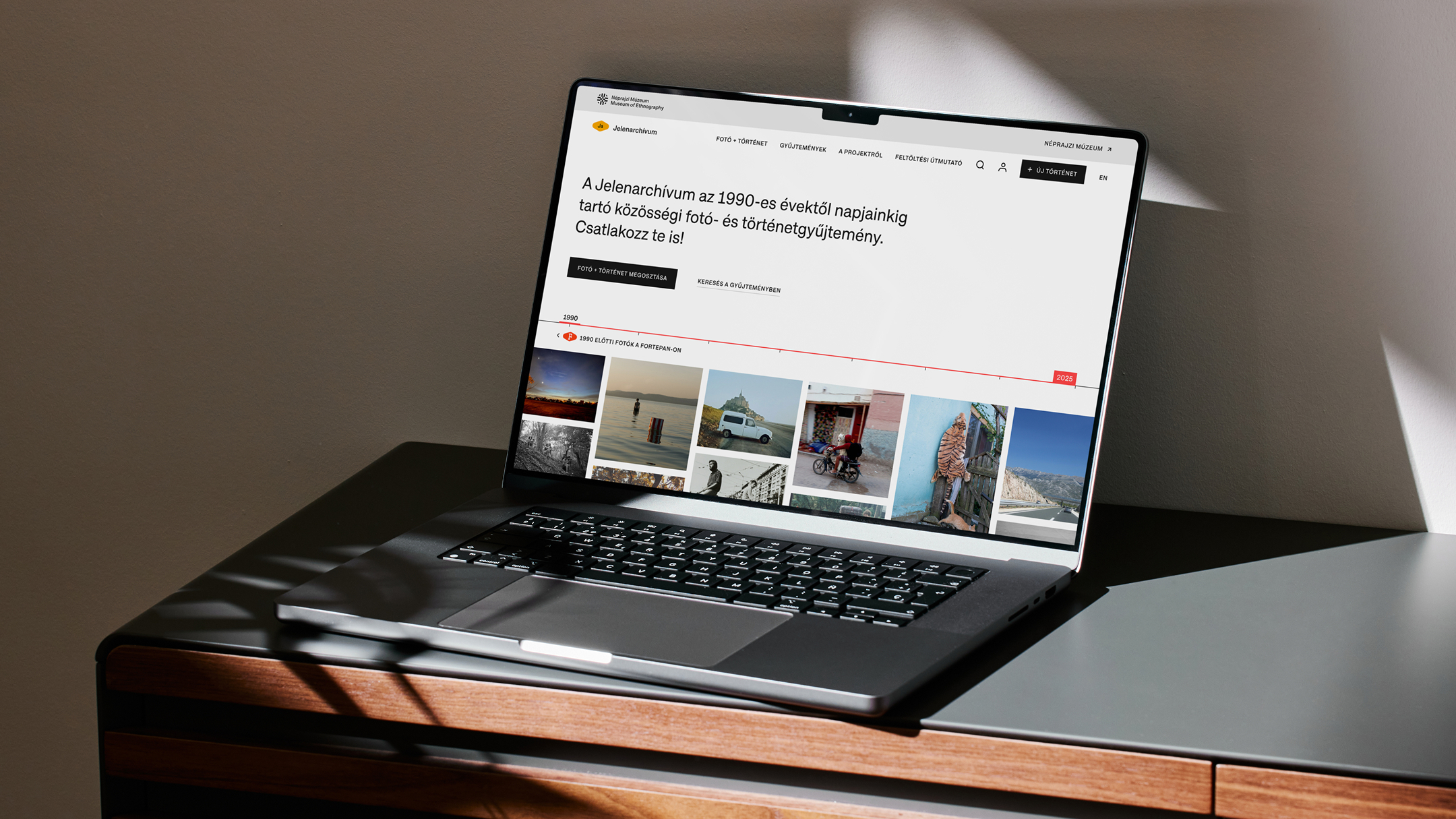


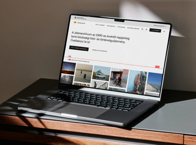
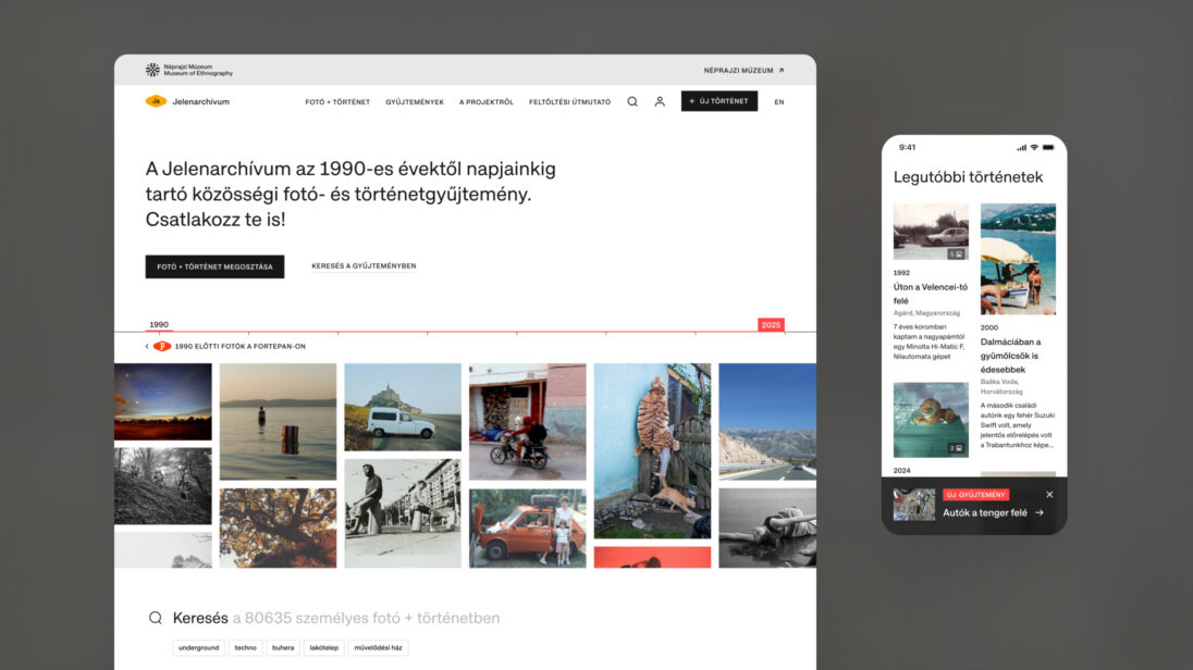
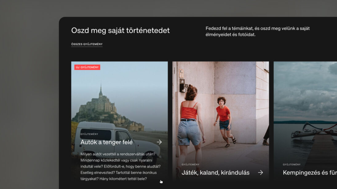
The Museum of Ethnography approached us with the goal of designing the digital interface for Jelenarchívum. The project, developed within the the MaDok program, focuses on collecting, organizing, and preserving photographs and personal stories from recent decades – from the 1990s to the present day. The archive allows the museum to document contemporary photographic practices while also expanding its modern-day collections.
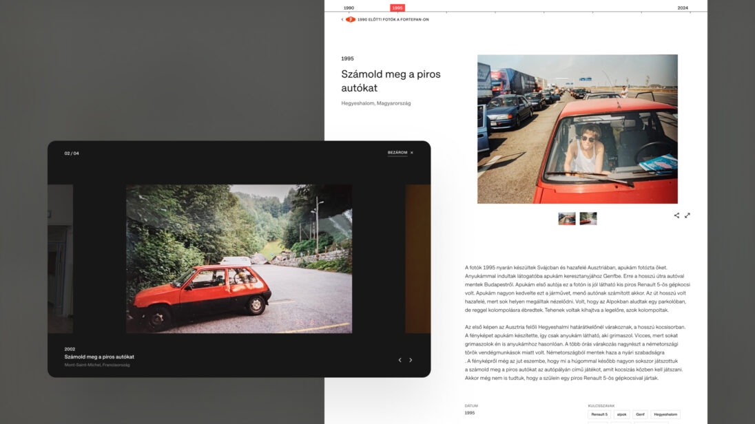
What makes the archive unique is its emphasis on mapping the connection between images and the personal narratives behind them. Rather than focusing solely on visuals, it highlights storytelling as a key component. Through thematic collection campaigns, users are invited to contribute their own photos and related stories, becoming part of a living, community-driven archive. Our goal was to create a user experience that not only encourages photo and story submissions but also enables visitors to explore and engage with existing content in a meaningful way.
One of the key challenges was to reflect the museum’s open, community-focused approach in the platform design while ensuring broad accessibility for diverse audiences.
Jelenarchívum was developed in collaboration with Fortepan – a public-domain photo archive documenting life in Hungary up to the 1990s. This partnership required us to ensure temporal and thematic continuity between the two archives.
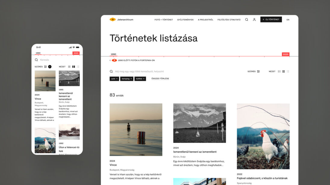
Since the platform is built around recurring thematic campaigns, it was crucial to develop a long-term, flexible architecture. We needed to design a technical and content framework capable of supporting the collection of visual and narrative material across multiple research topics – without requiring a structural overhaul for each new theme.
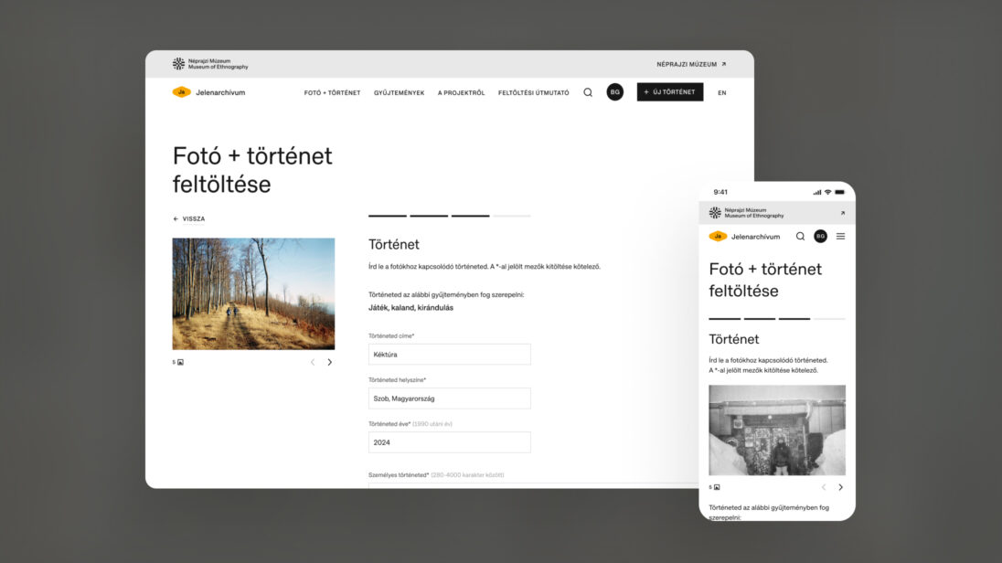
Simplifying and supporting the upload process was also a key design priority. At the same time, we had to ensure that submissions met archival quality standards. Given the diverse nature of user-generated content – varying in resolution, aspect ratio, and image quality – the platform needed to be adaptable. The same applied to the variety in story formats and text lengths.
Legal considerations around copyright and user rights were also central. We needed to embed these requirements into the upload flow in a way that felt seamless and user-friendly, while remaining clear and transparent. Additionally, we had to account for numerous real-world user scenarios – such as interrupted uploads, draft saving, story length limitations, and ensuring long-form texts remained readable on both mobile and desktop devices.
To lay a strong foundation, we began with stakeholder interviews to understand the needs and expectations of both museum staff and potential contributors. We also conducted a benchmark analysis of similar national and international platforms specializing in community storytelling and photo archiving. These insights helped shape our design strategy and inform UX decisions.
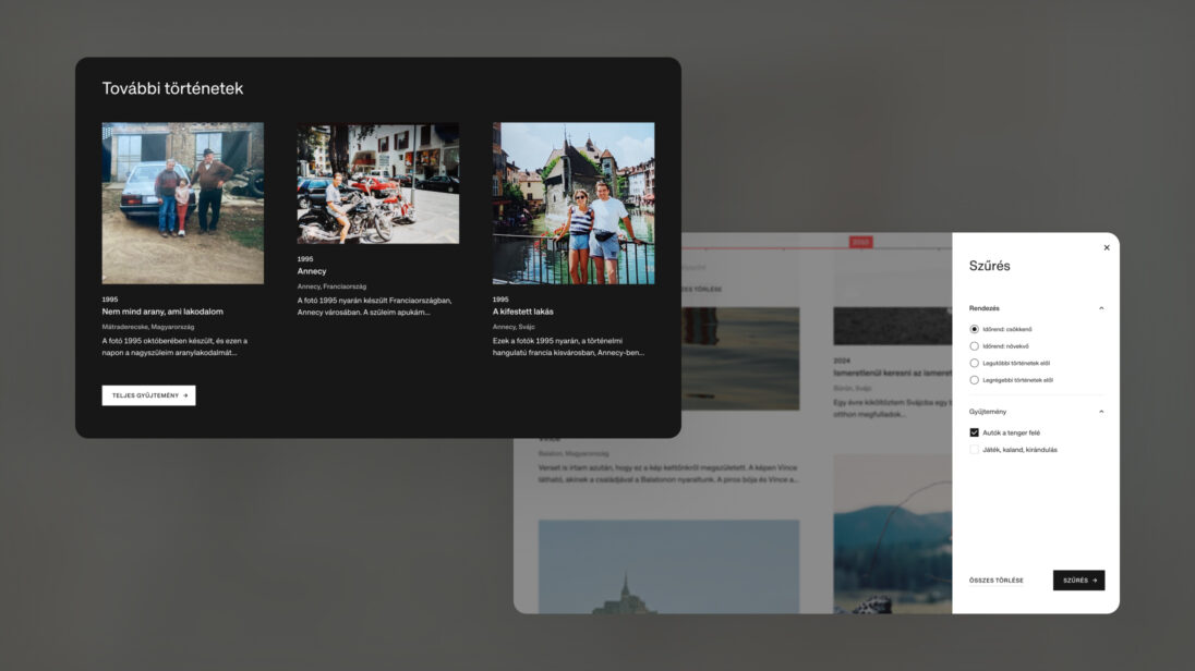
Our UX work focused on designing intuitive flows that would support both user-generated content and content discovery. Key features included:
A guided registration and login process
We designed the visual interface to align with the Museum of Ethnography’s digital identity. The design system ensures a consistent look and feel across components and devices, reinforcing user trust and institutional credibility.
We built the entire Jelenarchívum platform on Craft CMS. Based on the design plans, we created the necessary content types and field structures, and we set up an admin interface that is clear and easy to use for the museum’s team. The core features – user registration, login, photo and story submission, editing, and publishing – were all implemented as custom modules. This allowed us to tailor the system exactly to the project’s needs.
One of the biggest challenges was developing the multi-step publishing workflow. Users can first save their stories and photos as drafts, then submit them for approval. Administrators review these submissions on a dedicated interface and decide whether to publish them. We created custom backend logic to handle this process.
On the frontend, we used Tailwind CSS and vanilla JavaScript. For more complex features – such as search, filtering of results, and the entire submission flow – we built Vue.js components. The design system was well-structured, which made it easy to implement using Tailwind utility classes. Throughout development, we ensured the site met WCAG AA accessibility standards.
Development followed an iterative process. Once we had a working version, we held internal reviews and demos with the design team before presenting anything to the client. This helped us deliver thoughtful, high-quality solutions every time.
The result is a sustainable and scalable platform that supports both individual storytelling and the museum’s long-term archival and research goals.
The Jelenarchívum platform launched successfully and quickly generated strong community engagement. Within the first months, two thematic campaigns were already live, and users had submitted over 140 photographs and personal stories.
The success of the project was grounded in the close collaboration with the Museum of Ethnography, which remained actively involved from the initial concept phase through to implementation. The museum’s professional background and the design and development team’s digital expertise complemented each other well throughout the process.
In line with the platform’s long-term goals, planning for further functional development is ongoing. These future improvements aim to better support content collection, encourage user engagement, and serve research and archiving needs more effectively.

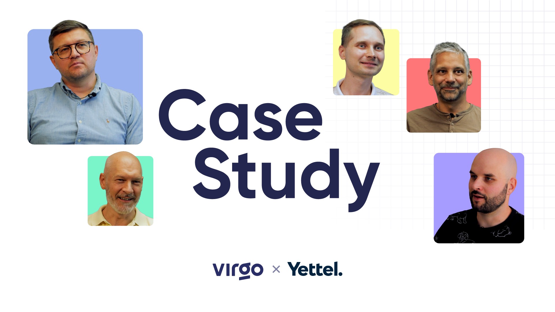
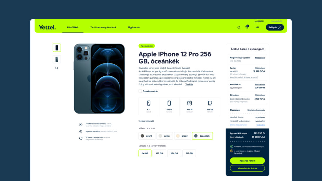
Yettel Hungary approached Virgo with the task of a comprehensive rebranding of its digital platforms including both web interfaces and the mobile application to align with its new brand identity. The assignment was distinguished by the fact that, at the outset of the project, both the new name and the visual direction were strictly confidential, and the rebranding itself was known only to a very select group of people.
The objective of the project went far beyond a simple visual makeover. The task was to ensure that Yettel’s entire digital presence would be ready for the moment of the rebranding in a way that it is functionally stable, visually consistent, and commercially secure. It was essential that users entering the new Yettel-interfaces experienced no disruption either in access to services or in the usual user journeys and processes.
Virgo supported the implementation end to end, providing Product Design, UX/UI design, front-end and back-end development, as well as continuous technical consultancy. The aim was to establish a scalable digital foundation that would not only enable the rebranding but also support Yettel’s business and product development goals in the long term.
There are projects that make history in the life of a company. The Telenor–Yettel rebranding was clearly one of them. It was not only a complete visual identity change, it all took place within a complex digital ecosystem that had been operating for years, across web and mobile applications, serving millions of users, with no margin for error.

The collaboration between Virgo and Yettel (formerly Telenor) did not begin with the rebranding itself, but much earlier, in 2017. The rebranding was already part of a long-term partnership. From the very beginning, our collaboration had been based on the approach that business goals and user experience should not come at each other’s expense, but rather reinforce one another.
Our collaboration began with the renewal of Telenor’s web interface. This had been attempted by another team previously, but without success. It is no coincidence that in-house the project was named Phoenix, as it was an initiative reborn after a previous failure, this time built on more conscious planning and stronger methodological foundations.
We would like to create something that is good for the business and good for the users — that’s the goal at the end of the day.

One of the greatest challenges was the tight deadline combined with the sheer scale of the system. Development took place in a brownfield environment, requiring integration with existing systems that had been in operation for years, while living with the consequences of previous technological and business decisions. All of this had to be achieved in a way that ensured the possibility of future expansion and development.
In the initial phase, the focus was deliberately not on innovation or impressive new features. The primary objective was the stable migration of business-critical core elements into the new system, including:
In these functions, there was no room for compromise: any error would have had immediate business and user-facing consequences. Stability and reliability therefore took priority throughout the entire project.

Throughout the project, we had to face not only technological but also methodological challenges. The “user stories” recorded in Telenor’s own Jira system were not, in fact, classic user stories, but rather complete user journeys and process descriptions. This caused significant difficulties during the handover process, as the client wished to validate delivery based on these items, while development tasks were structured differently, broken down into much smaller units.
This caused a major headache for both sides for a long time. Eventually, however, a mapping logic was established that built a bridge between the two approaches, making the system testable, deliverable, and meaningful from a business perspective. This kind of flexibility and shared learning ultimately added far more value to the project than a strictly “textbook” Scrum process could have.
The work was not limited only to visible front-end changes. In parallel, the technical foundations were modernized too, meaning PHP and database version upgrades as well as infrastructure and operating system enhancements.
This technical modernization went deep and often delivered results that were not immediately visible, yet it was one of the project’s greatest challenges. In a system of this scale, “working on the engine” is always risky, but unavoidable. The goal was that users would not notice any of it. These invisible yet critical interventions ensured stable and sustainable operation.
“This was an all-encompassing effort, where you couldn’t just fix only one segment of the system.” Due to the complexity of the challenge, the team often compared themselves to pop-culture heroes — Jedi, MacGyver, or Chuck Norris — and for good reason.
In 2022, Telenor underwent a complete brand and visual identity transition. The project was subject to extreme confidentiality: separate NDAs, isolated communication channels, and code names (YETI (from Yettel), Voldemort (He-Who-Must-Not-Be-Named), Rembrandt (because of rebranding)) were part of everyday work.
Based on the global brand guidelines, Virgo’s design team created the localized visual implementation for the Hungarian market across both web and mobile applications. Due to tight deadlines, there was no room for functional changes at this stage — the focus was on precise, consistent, and flawless execution of the new visual identity.
We were provided with a global brand identity and concept, and our task was to create the Hungarian redesign based on these foundations.


At the outset of the design and implementation process establishing a well-thought-out delivery strategy played a key role. Dedicated experts from both Virgo and Yettel were involved with clearly defined responsibilities and decision-making mechanisms.
The jointly developed roadmap milestones did not only structure the project timeline but also ensured that parallel design and development tasks remained synchronized. This coordination was essential given the tight deadlines and the high level of business risk.
New pages and components were created to support Yettel’s new tariff structure and service portfolio, while remaining aligned with established user behaviors.
On the day of the rebranding everyone was feverishly checking everything: code, databases, interfaces. One question hung in the air: Are we absolutely sure there isn’t a forgotten “Telenor” word or logo left anywhere?
One of the first checkpoints was Google. The top result: Wikipedia, still displaying the old logo. Rapid phone calls, quick reactions – and the switch was completed on one of the world’s most well-known online encyclopedias as well.
As a result of the project:
A very important takeaway and a great validation for us is that we are capable of working on a brand of this scale, delivering high quality results on time.
One of the most important characteristics of the Yettel–Virgo relationship was equality. This was not a classic client–vendor relationship, but a true partnership. Yettel underwent a lot of changes, and Virgo did its best to act as a stable, reliable anchor within a highly dynamic environment.
This approach proved successful: the Hungarian implementation included multiple solutions that were later adopted by other countries. This is not only a professional recognition but a clear validation that the team is able to create value at an international level.
Perhaps the project’s greatest achievement is that it has been proved that Virgo is capable of working on the digital presence of a global brand, delivering high quality on time, and without compromises. The web and mobile platforms operate reliably, the rebranding was executed seamlessly, and users received a cohesive, modern experience.
The takeaway is clear: truly large-scale projects are not only about technology or design. They are about trust, communication, flexibility, and the ability of a team to think together with the client — even when the project’s name itself cannot yet be spoken.


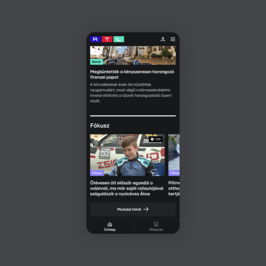
Virgo Systems partnered with RTL Hungary to redesign their digital platform, transitioning from a video-first website, (which was also designed by Virgo Systems in 2019) into a comprehensive news portal. This project involved an overhaul of UX/UI design, integrating both text and video content for an engaging user experience. The redesign was supported by Virgo’s front-end and back-end development, ensuring optimal performance across web and mobile platforms.
RTL Hungary sought to transform their existing video-centric platform into a comprehensive news portal. The challenge was to combine video content with more text-based articles, ensuring that both forms of content complement each other and drive engagement. The goal was to integrate RTL’s news articles, TV shows, and promotional content into a single, coherent digital experience.
We encountered several challenges that made this project unique.
We had to design a news portal with a unique structure, which included space for TV broadcasts, show videos, and promotional content. This duality had to be unified in a way that, alongside the video content, much more text-based content and articles would be visible. According to the concept, on the new portal, different types of content had to complement each other — meaning that text-based content should have related video content, and video content should also be accompanied by text.
The biggest challenge was rethinking and designing the user experience, where we had to channel various ideas and concepts within the newly forming editorial team into implementable solutions.
Even before the brand rebranding, we sought visual solutions that would support and make the future interface easy to use. We also had to design a temporary rtl.hu logo to ensure the news portal remained easily recognizable during the transition period.
As the first step in the process, we began with UX research, during which we thoroughly assessed the needs of both the client and the users.

The client aimed to start online sales for three product categories:
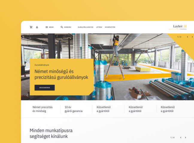
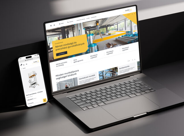
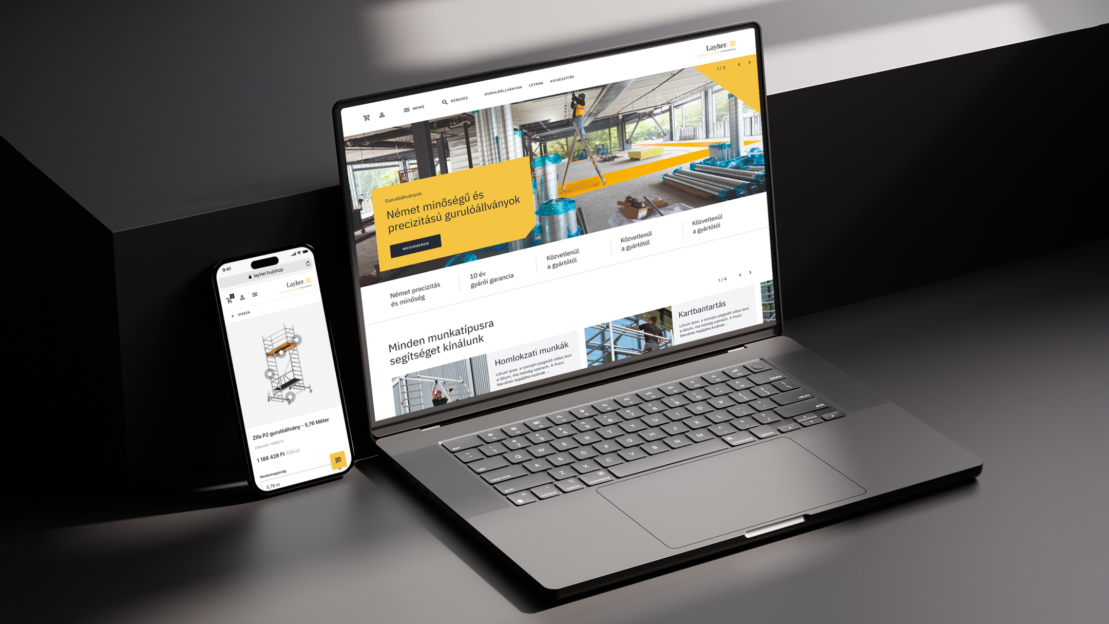
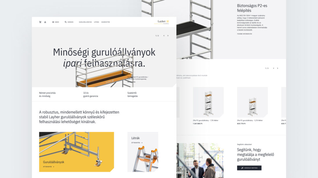
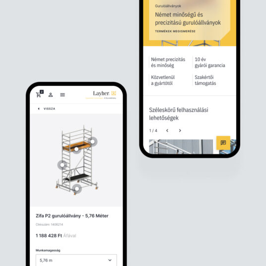
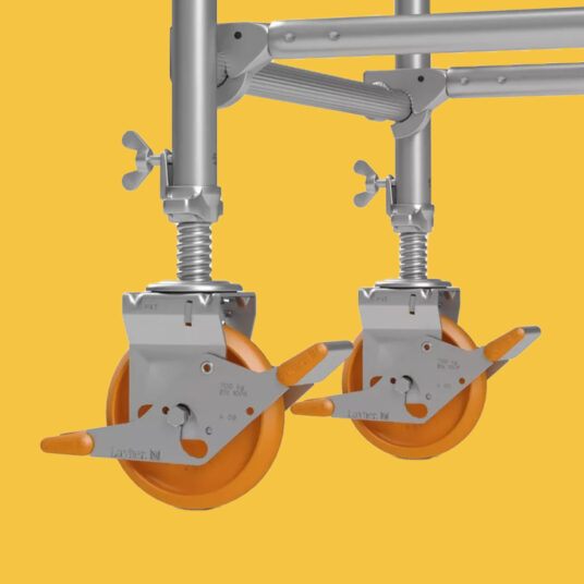
The goal was to create a webshop that adheres to professional standards, showcasing the different types of scaffolding and the configuration options related to them. The finished website did not need to closely follow Layher’s current branding; it was far more important that it reflected the premium quality that Layher products represent.
One of the main motivating factors for creating the new webshop was to bring more focus to the mobile scaffolding product category in sales. While Layher is the market leader in building scaffolding in Hungary, it is not in mobile scaffolding. This is due not only to strong competition but also to a market characteristic: the Hungarian market is extremely price-sensitive, and Layher’s products are positioned at a higher price point. Therefore, we designed a user journey for the webshop that best serves this multi-step introduction process for customers.
Layher stands out from its competitors in terms of expertise and customer support related to its products, so it was essential to highlight the option for personal assistance for customers within the webshop. In the construction industry, customers appreciate personal communication and often visit the company and check the showroom before making a purchase. Therefore, the webshop emphasized the possibility of personal assistance, maintaining a balance between communication options (phone consultation, chat) and online purchasing.
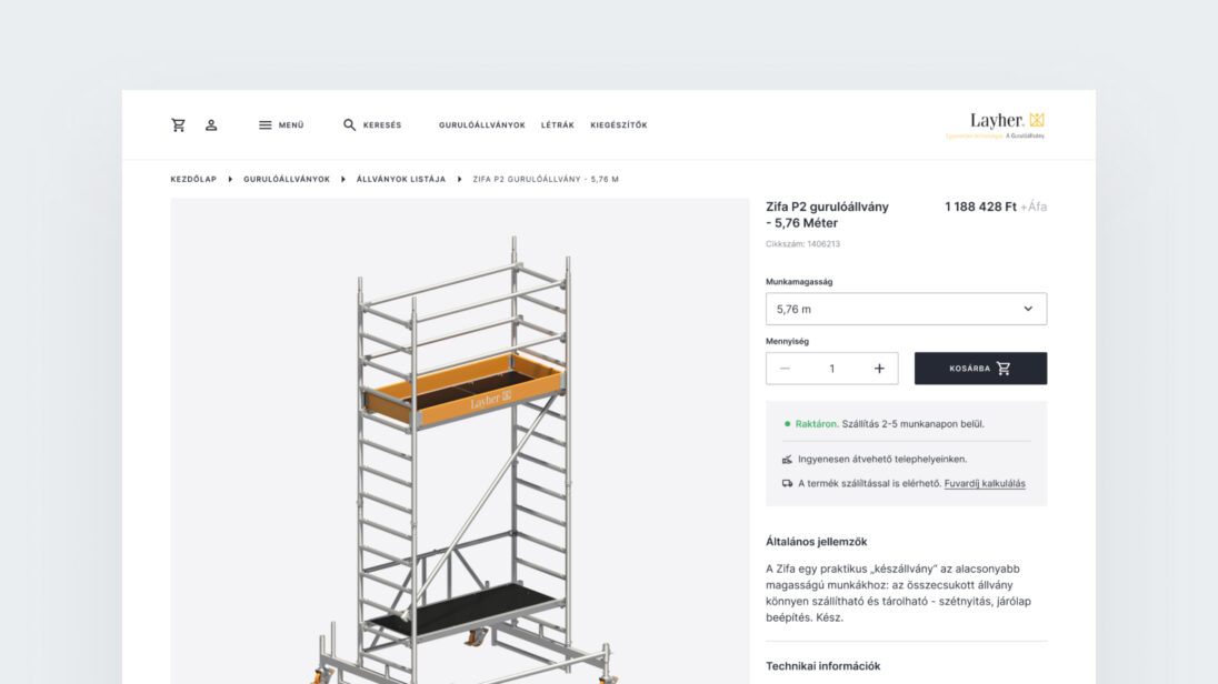
Another challenge was solving the delivery issue, as the products are oversized and heavy, making it difficult to calculate the delivery cost. However, from the end user’s perspective, knowing the delivery fee is important so that they can decide whether in-store pickup or home delivery is more cost-effective before completing the purchase. To address this, we created a shipping cost calculator that calculates the delivery cost for the customer based on product attributes and postal code.
In the initial phase of the design process, we uncovered the client’s motivations behind the need for a digital product. Afterward, we built prototypes from wireframes to validate our solutions. Following this, we constructed the webshop’s elements based on an approved UI concept and compiled them into a UI kit.
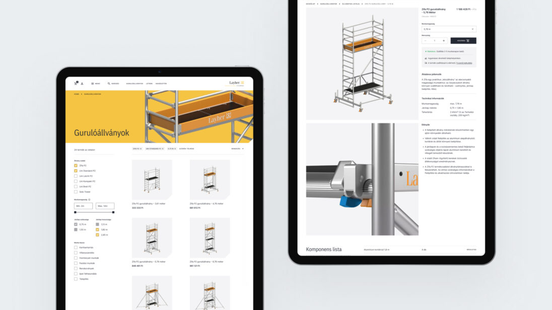
By the end of the project, we created a unique webshop with a visual atmosphere that aligns perfectly with the products. Throughout the purchasing and information-gathering processes, we considered it essential to provide active support to users. One of the primary reasons for this is that a significant portion of workers in the construction industry prefer using traditional communication channels (phone calls, face-to-face conversations) to handle procurement-related tasks, where immediate feedback is guaranteed. Additionally, rolling scaffolds are complex and expensive technical products, often requiring expert assistance and further consultation for proper configuration. Based on these factors, we integrated solutions into the webshop that facilitate two-way communication for customers, ensuring that the platform is easy to navigate and functional on mobile devices as well.
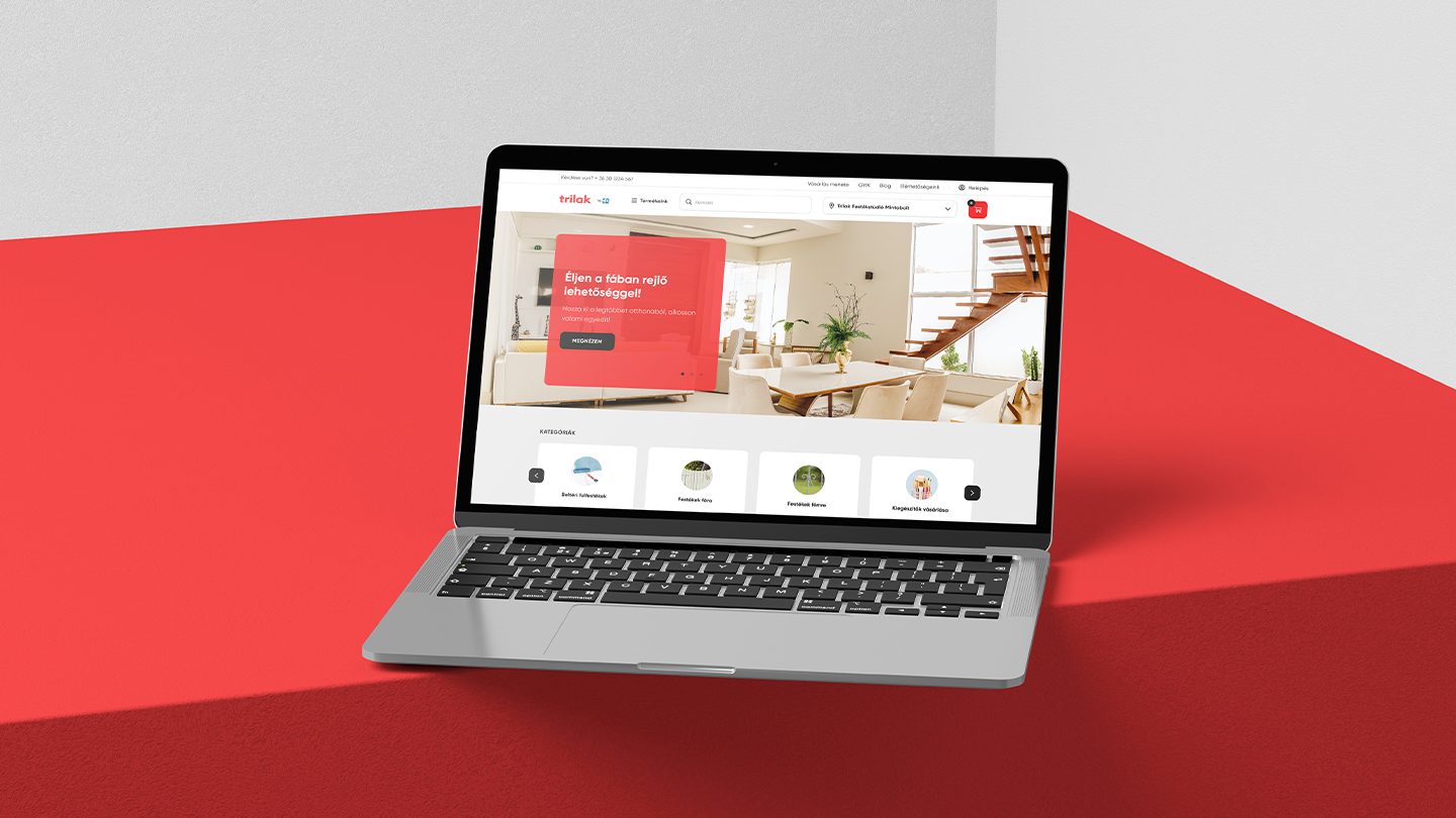


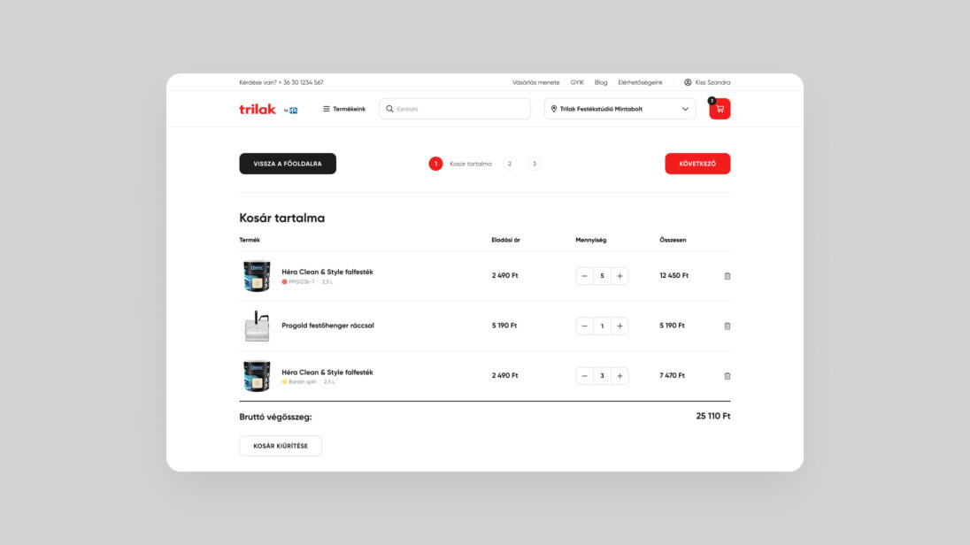
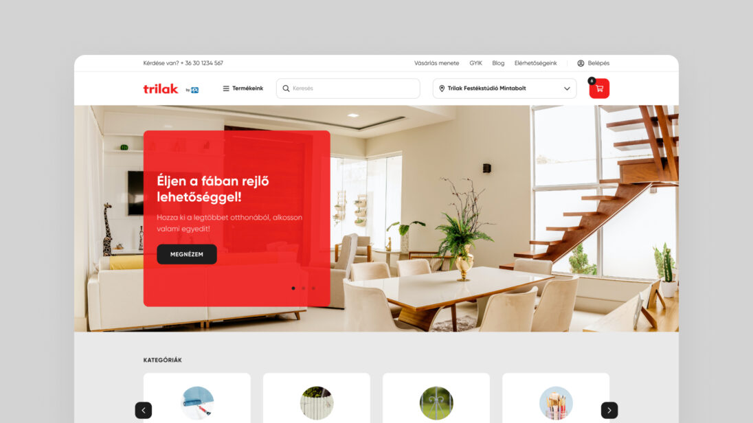
PPG Trilak, a paint manufacturer and distributor, was founded in 1907 in Budapest. The company, still a market leader in Hungary, operates as a subsidiary of PPG and exports about one-third of its production abroad.
Due to the rise of online shopping and the impact of the pandemic, the company decided to take its first decisive step toward electronic sales. They sought a solution that could be launched quickly and developed incrementally, fully meeting their sales vision.
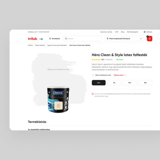
The click & collect webshop best met our client’s expectations. We created a custom solution tailored to the unique characteristics of the franchise network and the complexity of the customer base.
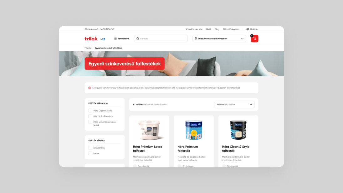
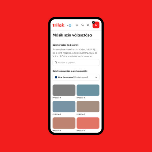
The complexity of the task lay in PPG Trilak’s diverse customer base, which includes both professional experts (B2B) and occasional home renovators (B2C). Creating an optimal customer experience for all target groups was a significant challenge, as we had to provide knowledgeable support for casual buyers while not hindering the product selection process for returning professionals.
A key goal was to ensure that all customers could quickly and easily find the right products with the appropriate level of support, without the different journeys interfering with each other. For example, frequent professional customers should not be slowed down by excessive guidance, while casual shoppers should receive comprehensive assistance and expert support, similar to what they would experience in stores. To support informed decisions, we conducted UX research to understand the real needs and behaviors of the client’s customer base.
Various UX and UI design methods were employed during the project to understand the needs of the client and the different user groups.
We grouped the most important findings from the UX research by identified problem areas, then synthesized the results into wireframes based on significant insights. The problem areas included:
The click & collect solutions effectively showcase the product range, guide customers to stores, and promote products online, allowing conversions and transactions to be measured during online marketing campaigns. Another major challenge of the project was the franchise network’s unique characteristics, which had to be considered when designing the e-commerce solution.
Since there was no central, up-to-date system for the franchise partners’ inventory and operations, we expanded the admin functions to ensure quick and efficient handling of functions such as:
Based on initial feedback from franchise partners, a well-thought-out and carefully implemented solution was delivered, providing a solid foundation for the company’s future development plans and the gradual build-up of the digital sales channel.