It was like replacing the engine of a speeding car — it took meticulous preparation, detailed planning, early-stage migration, and a seamless handover.

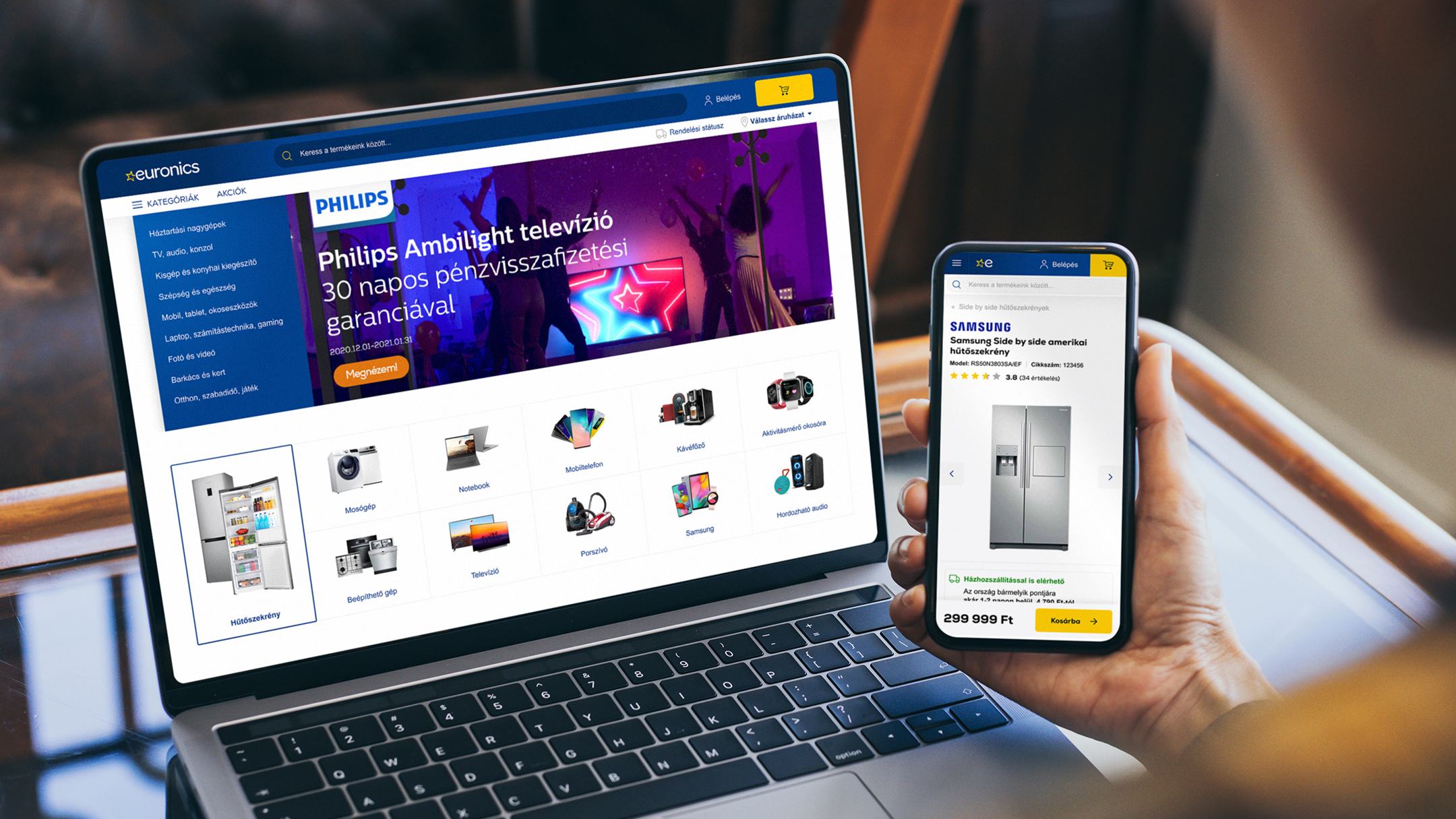
Euronics’ renewed webshop won the Grand Star at the HungarEcomm Stars 2024 Awards and, for the third year in a row, is the highest-grossing 100% Hungarian-owned e-commerce site. The large-scale project was led by Virgo, and we have plenty to share about it. Take a look behind the scenes of a true success story!
It was like replacing the engine of a speeding car — it took meticulous preparation, detailed planning, early-stage migration, and a seamless handover.

We began collaborating with the Euronics team in 2020 to develop their new webshop. Beyond technological upgrades, we completely redesigned the user experience and visual appearance. Our main objective was to increase webshop traffic, which we achieved using modern development tools, the implementation of new backend processes, and the creation of user journeys aimed at improving conversion rates.
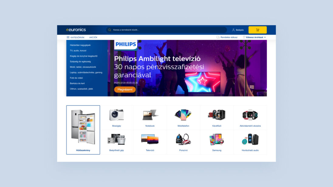
Redesigning the Euronics webshop came with several complex challenges. Our goal was to create a modern, user-friendly platform that not only provides an outstanding shopping experience but can also manage complex product categories and a catalogue of tens of thousands of products. We had to harmonize clarity, fast navigation, and visual appeal while ensuring the webshop worked smoothly across all devices. Responsive design, fast page loading, and the integration of both online and offline shopping needs were key to success.
From a technological standpoint, one of the biggest challenges was integrating both existing and new third-party systems and ensuring seamless data flow. We placed particular emphasis on establishing effective communication channels with various partners to identify bottlenecks and collaboratively develop targeted, long-term solutions.
Our team’s strength lies in our ability to quickly respond to changes, adapt flexibly to new situations, and ensure that no tasks “fall through the cracks.” We actively support the coordination of different departments and vendors, maintaining an end-to-end view of the process instead of focusing only on isolated programs or tasks. We strive for solutions that holistically support the client’s business goals.
Thanks to our market experience, we stay up to date with trends, understand the opportunities, pitfalls, and challenges. We don’t just deliver software—we stay by our clients’ side long term: operating, fine-tuning, and continuously improving systems to maximize their value. For us, success means establishing and maintaining stable, long-term partnerships with our clients.
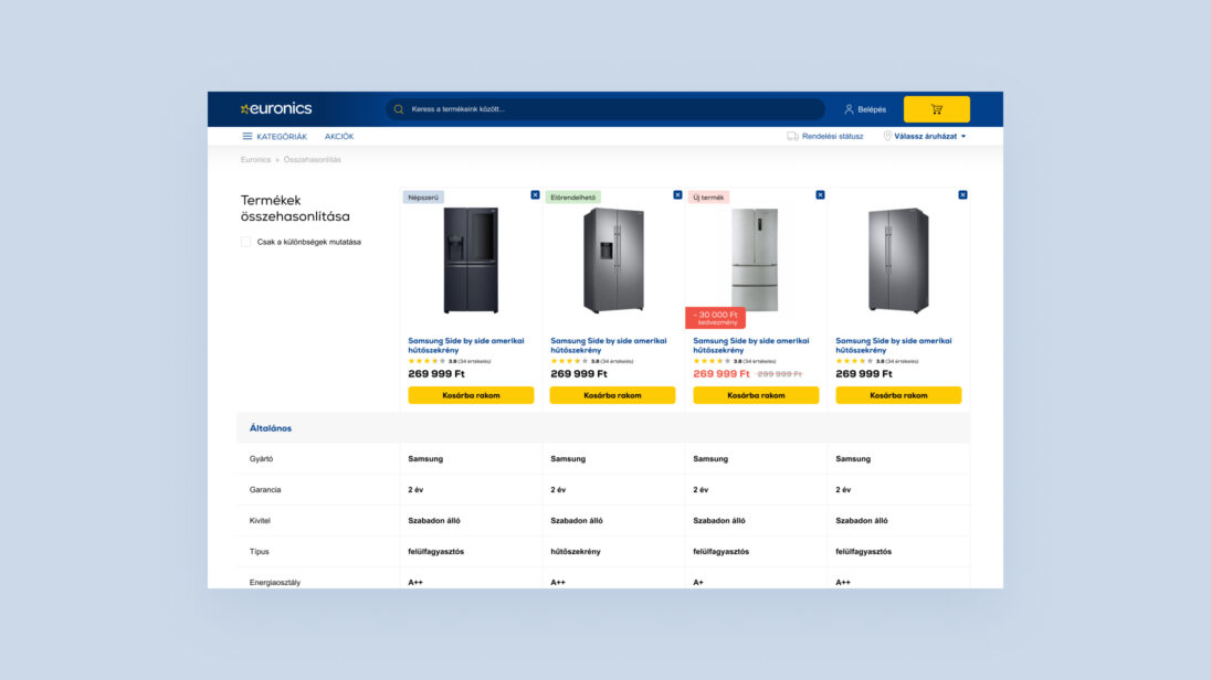
We kicked off the project with thorough research to assess both client and user expectations and needs regarding the webshop.
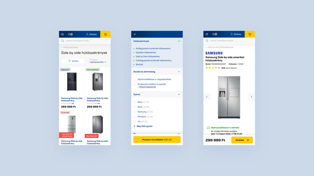
The frontend was developed using a responsive approach, based on Bootstrap, using jQuery and Stencil.js.
In recent years, Euronics’ digital developments have not only brought technological advancements but also delivered tangible business results. Between 2018 and 2021, the share of online sales more than doubled, a growth further accelerated by the pandemic. Within just four years, the company moved from 12th to 6th place on the GKI Digital ranking of Hungary’s highest-grossing online retailers. In 2022, it was once again named the largest 100% Hungarian-owned online retailer.
At the heart of this success was a clear goal: to provide the best possible customer experience in the digital space. When redesigning the webshop, Euronics aligned its platform with the latest consumer trends. The search logic was restructured to help users find products and brand pages more efficiently.
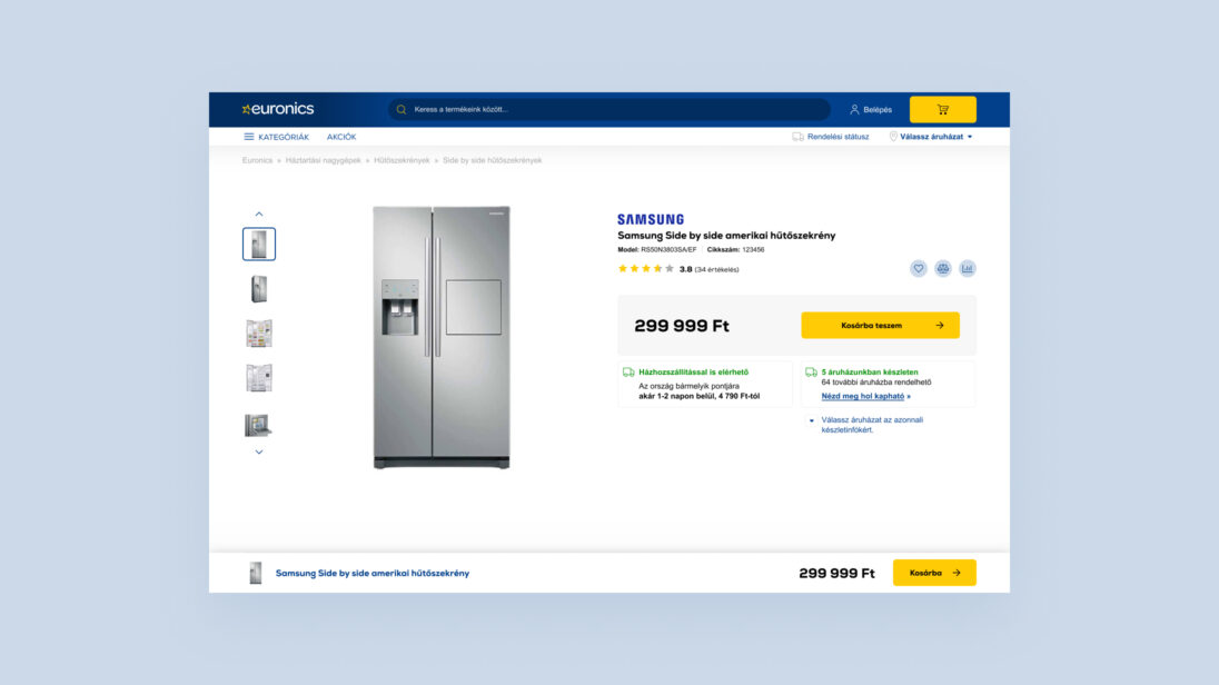
The checkout process was streamlined, guest checkout was made seamless, and personalized product recommendations were further refined. Flexible delivery time slots were also introduced to better fit customers’ schedules.
Equally important was choosing a webshop engine capable of handling increasing traffic loads with speed and stability—ensuring smooth performance even during peak periods.
These achievements clearly demonstrate that when customer experience is prioritized, business success follows naturally. Euronics can be proud of the progress made and grateful to everyone who contributed to this outstanding project.
I ordered online — choosing and placing the order was super easy thanks to a really user-friendly interface. Delivery was fast, but unfortunately the product didn’t work out for me. That’s when it really helped that there was a store nearby where the return process was smooth and hassle-free.
I always buy my devices and gadgets here — it’s a no-brainer for me. The webshop works great: easy to search, order, and pay. The email notifications are clear and to the point, so I never have to worry about the status of my order. Plus, the prices are really good, especially considering they also have physical stores. There was even a time when I ordered something online, but happened to be near a store the next day — I popped in, they had it in stock, and I was able to pick it up right away. They were super flexible about it.
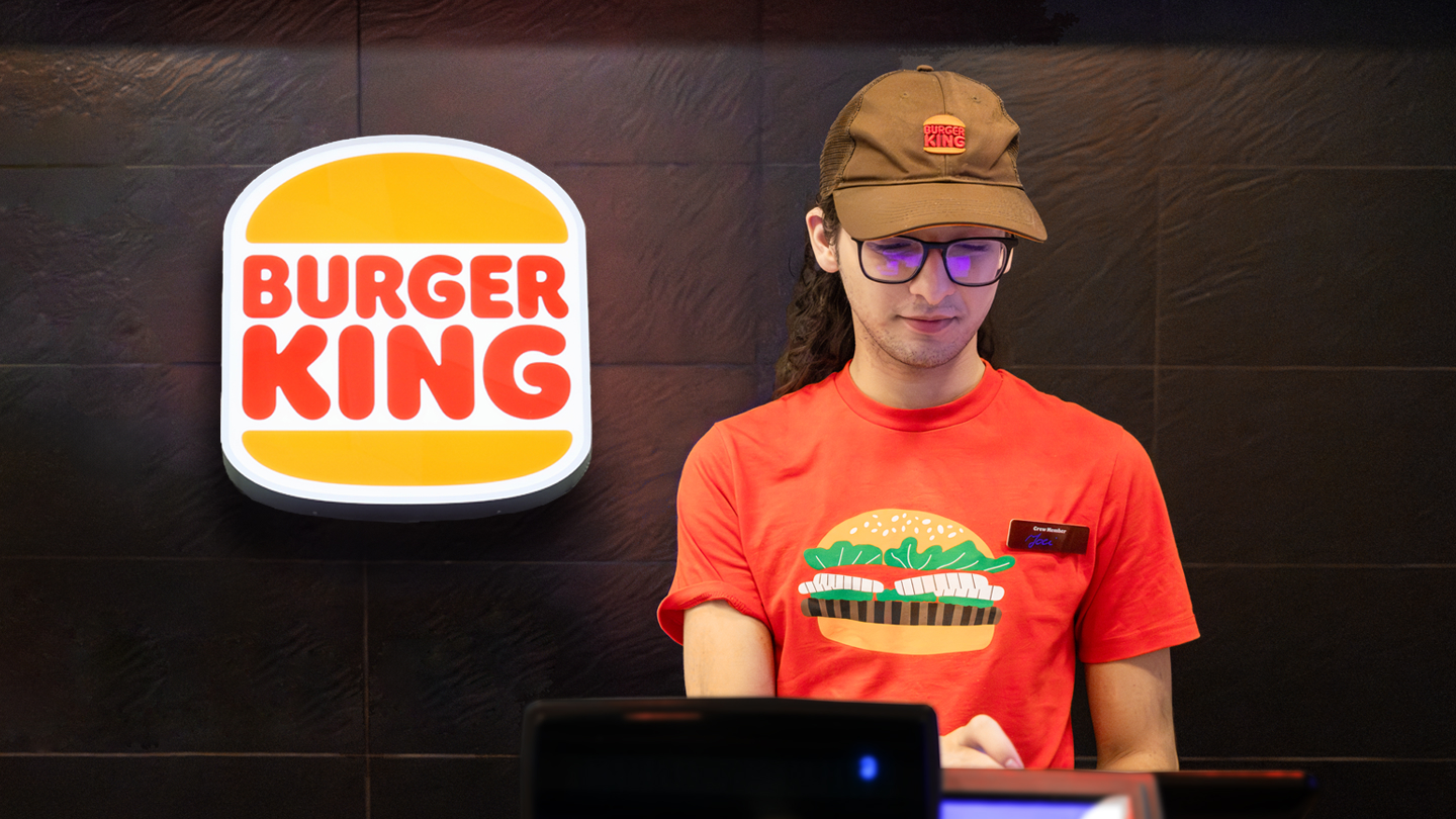


Burger King Hungary aimed to modernize their cash register system to better align with current operational demands, reducing inefficiencies in the order-taking and service process. The redesigned system also needed to accommodate different restaurant types (drive-in, food court, etc.), ensuring adaptability across various environments.
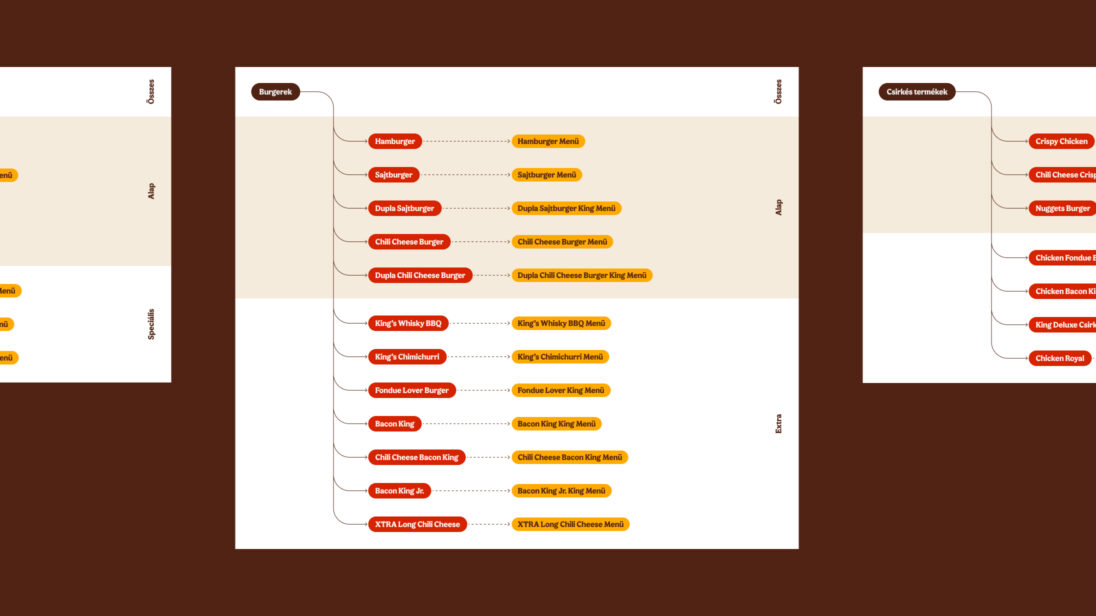
One of the major challenges was integrating the new system into the existing workflow, ensuring that long-term staff could transition smoothly. Additionally, the system needed to handle different restaurant operations while optimizing the order-taking process for faster service. The increasing role of digital channels (self-service kiosks, mobile apps, and delivery services) added complexity, requiring the system to integrate these elements seamlessly.
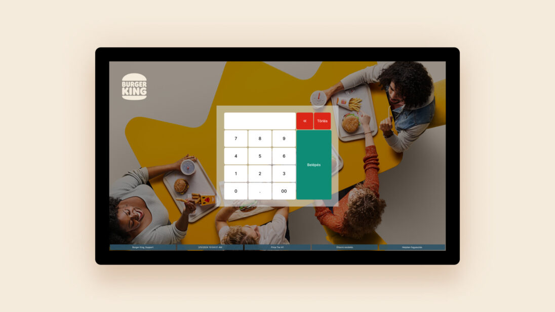
The first step of the design process was UX research, during which we thoroughly examined how employees use the cash register system in a real restaurant environment and how it fits into the daily restaurant operations.
Our main goal during the design process was to improve the system’s clarity and usability.
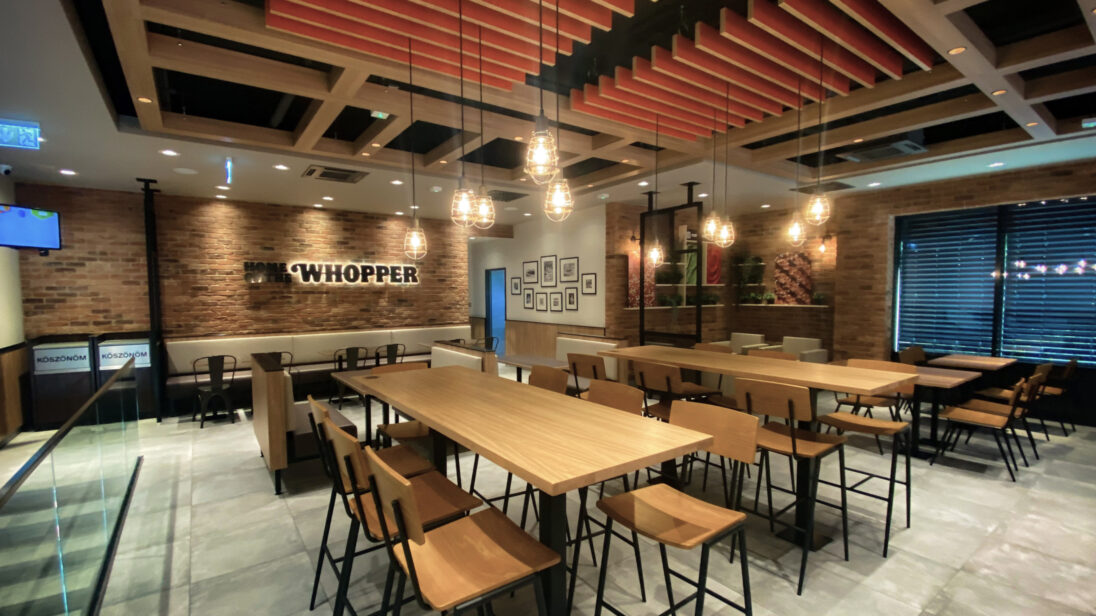
Our goal was to ensure that the new cash register system seamlessly fits into the employees’ established processes while simplifying order-taking.

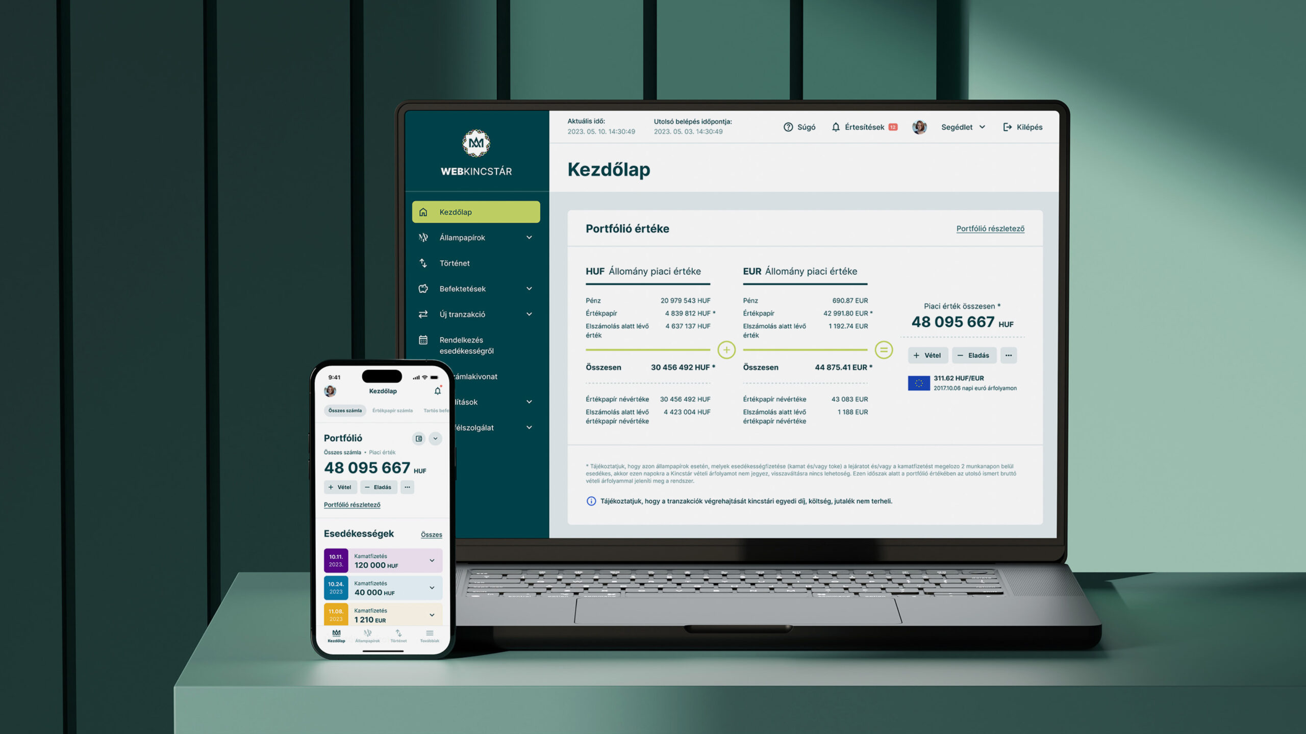


Dorsum approached us with the goal of renewing the visual appearance of the Hungarian State Treasury’s online distribution channels – Webkincstár and Mobilkincstár – and redesigning certain user interfaces to improve the customer experience.
One of the most important objectives in the system renewal was to make the products more appealing to younger generations, while ensuring that the current users would not experience any discomfort in their use. Additionally, a fundamental requirement was to ensure that the updated interfaces would reach as many users as possible, so we paid special attention to complying with accessibility guidelines.
It was crucial that the visual renewal enhance the user experience with modern UI solutions, particularly for mobile applications (iOS, Android).
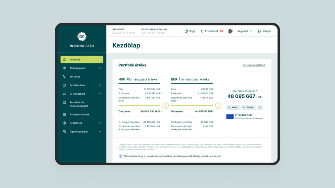
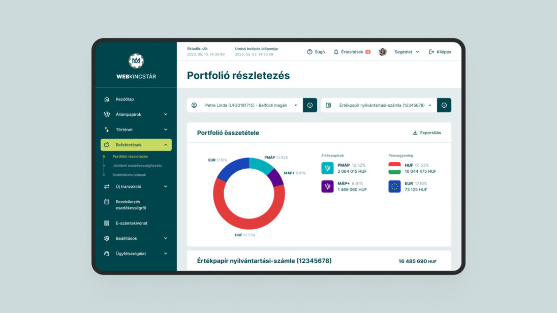
One of the biggest challenges was designing an interface that meets the needs of different user groups. The younger generation requires intuitive and modern solutions, while older users value a familiar structure and simplicity of use. Additionally, the digital interfaces had to comply with accessibility regulations.
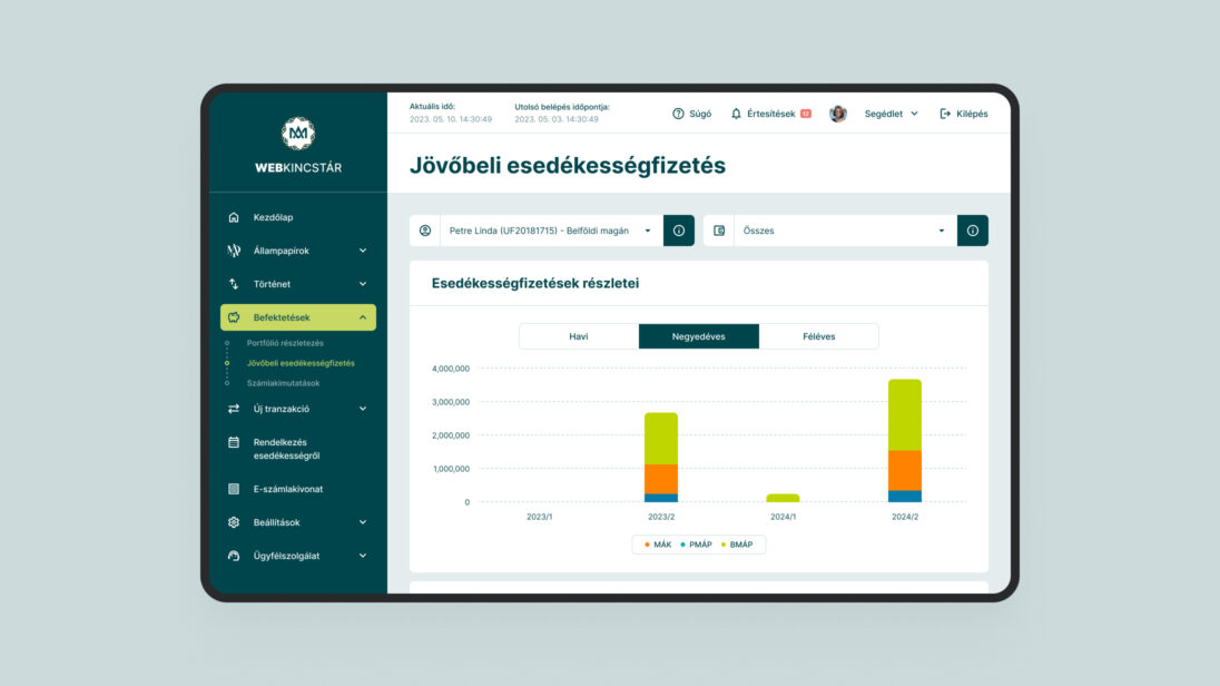

During the project, we applied various UX and UI design methods to understand the needs of the client and the users.
Optimized Core Functions: Key processes such as registration, transaction handling, and portfolio management were streamlined to improve the user experience.
A consistent design system was developed, based on Magyar Államkincstár’s visual guidelines, integrating modern UI elements.

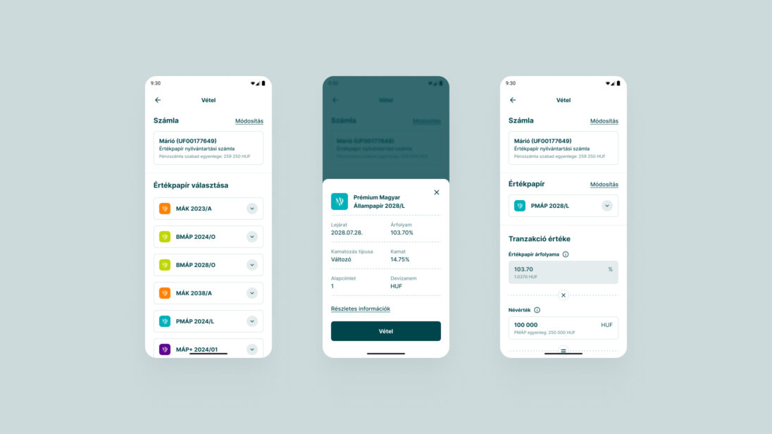
The biggest challenge was redesigning the interface to meet the needs of both younger users, who prefer modern, intuitive solutions, and older users, who value simplicity and familiarity. All of this while ensuring the platform adheres to accessibility standards.


Yettel Hungary approached us with the task of implementing their new brand identity across their digital platforms. We were honored to be entrusted with this task, especially since at the time, both the new name and visual direction were kept entirely confidential.
The goal was to ensure that by the time the company changed its name and visual identity, their web platforms and app would be updated accordingly, ensuring a smooth transition. We supported this effort through Product Design, Front-end, and Back-end development.

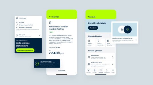
One of the biggest challenges was the short deadline, requiring close collaboration between our experts and the client’s team. We had to rethink and redevelop many components and pages to ensure that the new brand would work seamlessly across platforms. In addition, we had to integrate a digital identity and design elements created by another agency, which served as the foundation for implementing the Hungarian website. All of this had to be done in a way that maintained consistency on both the responsive website and the mobile application.
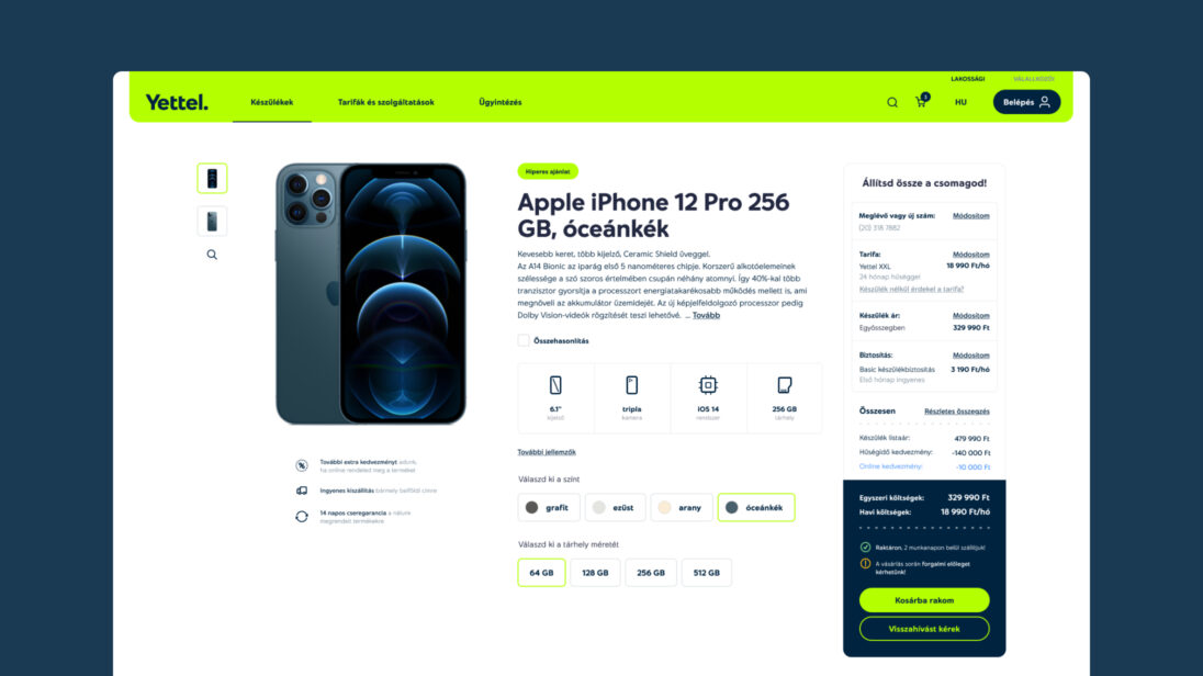

In the initial phase of the design process, it was crucial to create a well-thought-out roadmap and establish a well-organized team from both the client’s and our side. This ensured that all processes were in sync and each step progressed in the most optimal way possible. By agreeing on milestones and tasks, we could more easily track progress and ensure that we delivered the required elements on time and with the appropriate quality.
The project was successfully completed on time, and the Yettel Hungary website and mobile application were fully revamped, offering a cohesive user experience across all devices. This achievement was largely due to the well-organized approach and collaborative mindset of the client’s digital team, making the entire process smoother and more efficient.
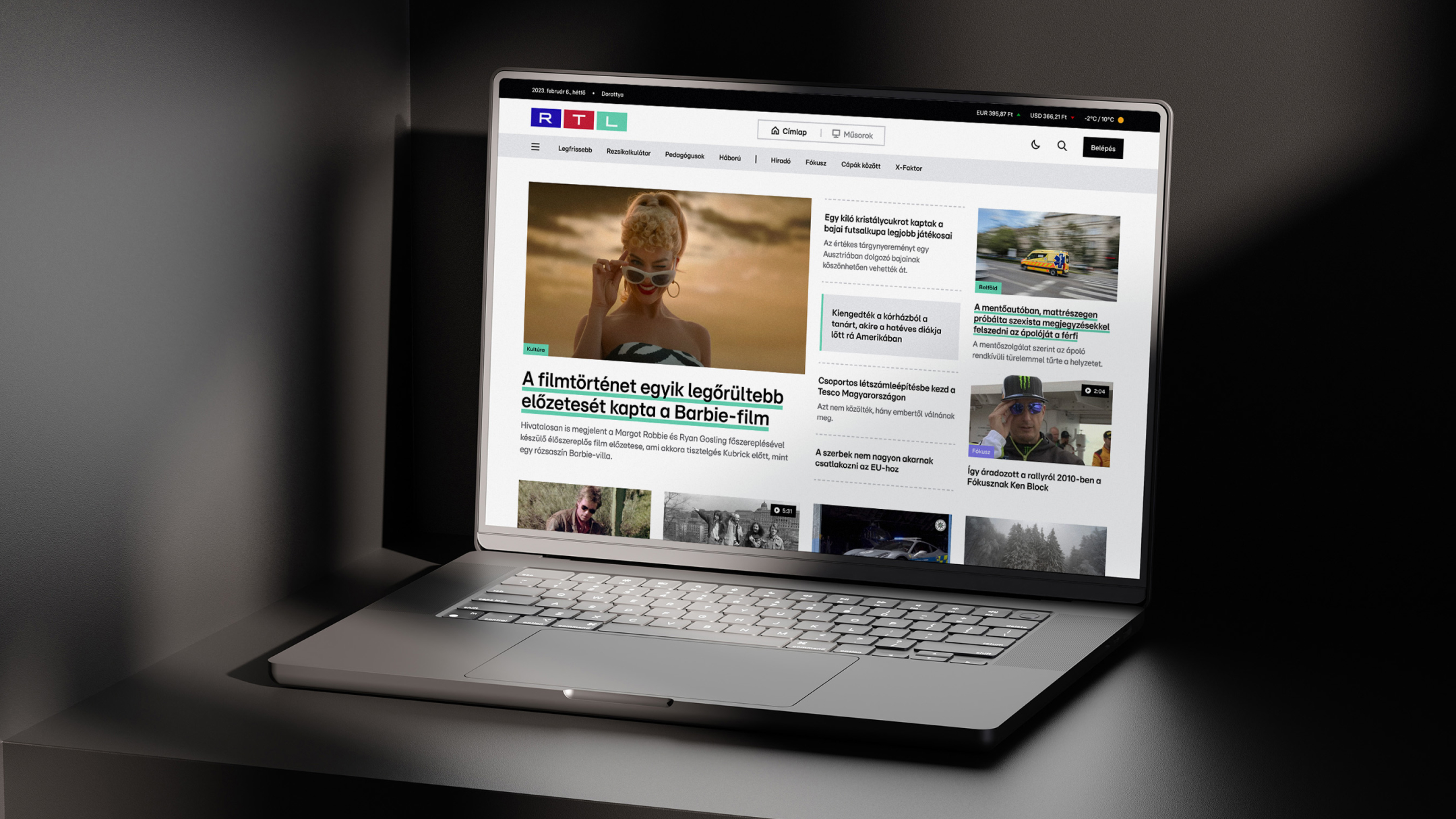


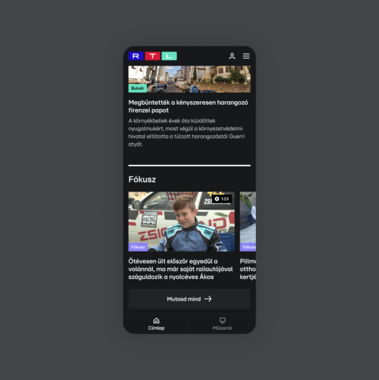
Virgo Systems partnered with RTL Hungary to redesign their digital platform, transitioning from a video-first website, (which was also designed by Virgo Systems in 2019) into a comprehensive news portal. This project involved an overhaul of UX/UI design, integrating both text and video content for an engaging user experience. The redesign was supported by Virgo’s front-end and back-end development, ensuring optimal performance across web and mobile platforms.
RTL Hungary sought to transform their existing video-centric platform into a comprehensive news portal. The challenge was to combine video content with more text-based articles, ensuring that both forms of content complement each other and drive engagement. The goal was to integrate RTL’s news articles, TV shows, and promotional content into a single, coherent digital experience.
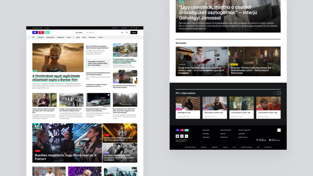
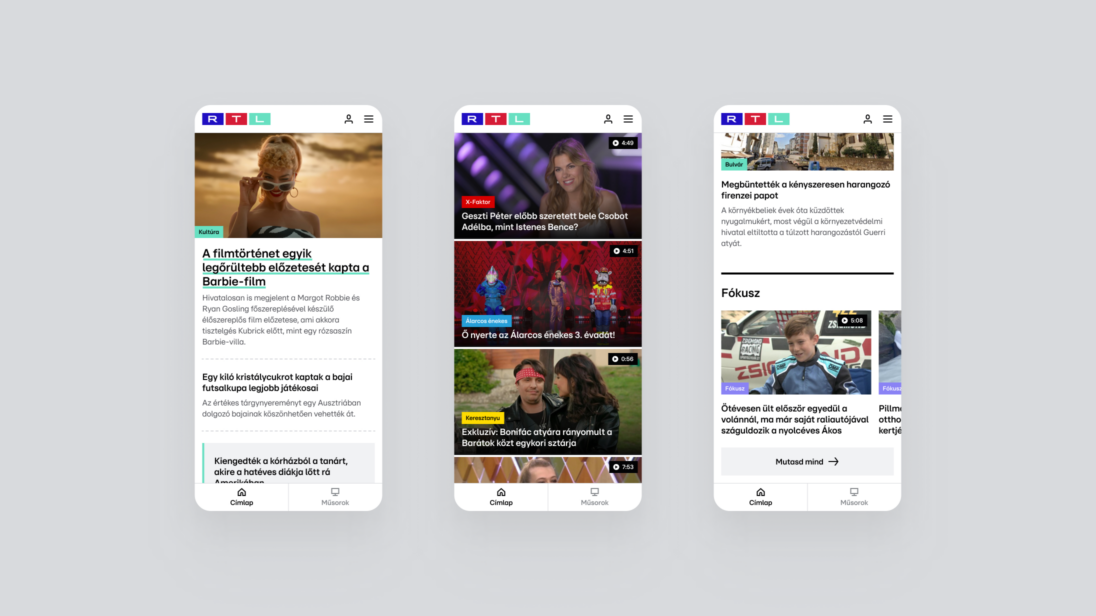
We encountered several challenges that made this project unique.
We had to design a news portal with a unique structure, which included space for TV broadcasts, show videos, and promotional content. This duality had to be unified in a way that, alongside the video content, much more text-based content and articles would be visible. According to the concept, on the new portal, different types of content had to complement each other — meaning that text-based content should have related video content, and video content should also be accompanied by text.
The biggest challenge was rethinking and designing the user experience, where we had to channel various ideas and concepts within the newly forming editorial team into implementable solutions.
Even before the brand rebranding, we sought visual solutions that would support and make the future interface easy to use. We also had to design a temporary rtl.hu logo to ensure the news portal remained easily recognizable during the transition period.



As the first step in the process, we began with UX research, during which we thoroughly assessed the needs of both the client and the users.



The client aimed to start online sales for three product categories:
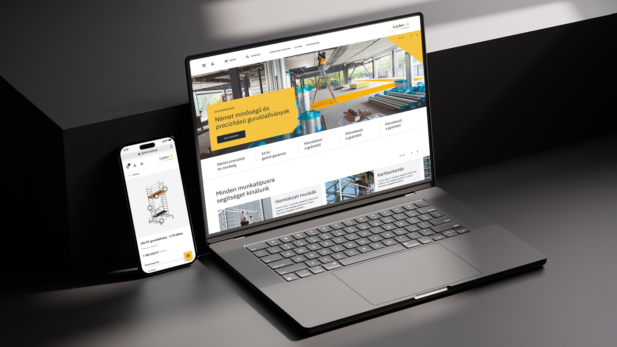
The goal was to create a webshop that adheres to professional standards, showcasing the different types of scaffolding and the configuration options related to them. The finished website did not need to closely follow Layher’s current branding; it was far more important that it reflected the premium quality that Layher products represent.
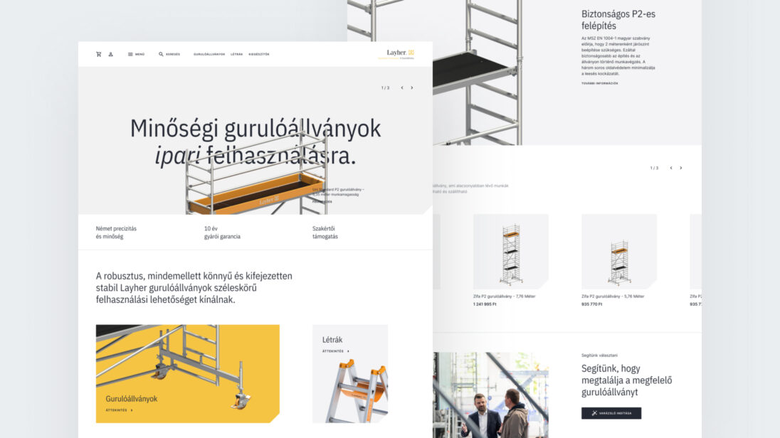
One of the main motivating factors for creating the new webshop was to bring more focus to the mobile scaffolding product category in sales. While Layher is the market leader in building scaffolding in Hungary, it is not in mobile scaffolding. This is due not only to strong competition but also to a market characteristic: the Hungarian market is extremely price-sensitive, and Layher’s products are positioned at a higher price point. Therefore, we designed a user journey for the webshop that best serves this multi-step introduction process for customers.
Layher stands out from its competitors in terms of expertise and customer support related to its products, so it was essential to highlight the option for personal assistance for customers within the webshop. In the construction industry, customers appreciate personal communication and often visit the company and check the showroom before making a purchase. Therefore, the webshop emphasized the possibility of personal assistance, maintaining a balance between communication options (phone consultation, chat) and online purchasing.
Another challenge was solving the delivery issue, as the products are oversized and heavy, making it difficult to calculate the delivery cost. However, from the end user’s perspective, knowing the delivery fee is important so that they can decide whether in-store pickup or home delivery is more cost-effective before completing the purchase. To address this, we created a shipping cost calculator that calculates the delivery cost for the customer based on product attributes and postal code.
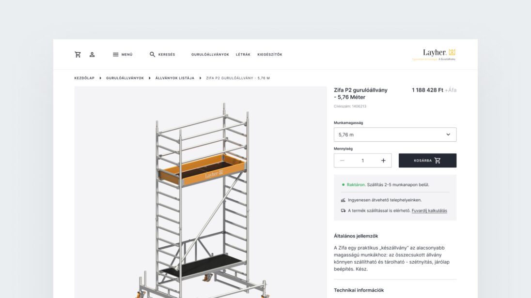
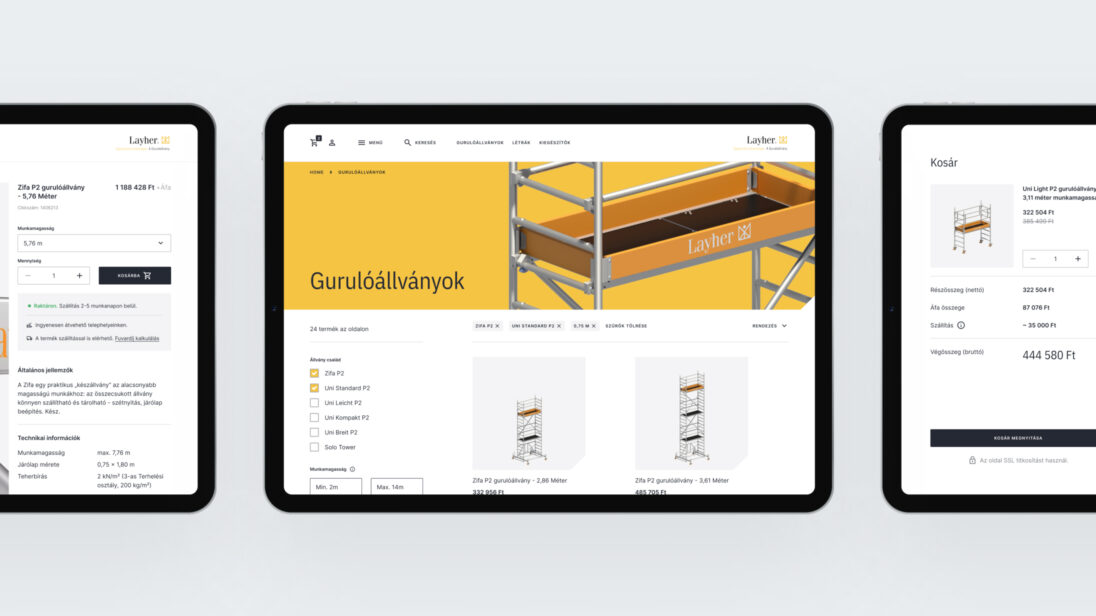
In the initial phase of the design process, we uncovered the client’s motivations behind the need for a digital product. Afterward, we built prototypes from wireframes to validate our solutions. Following this, we constructed the webshop’s elements based on an approved UI concept and compiled them into a UI kit.
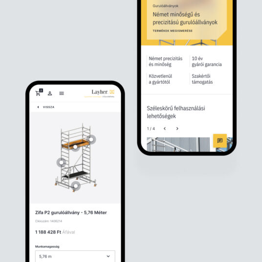
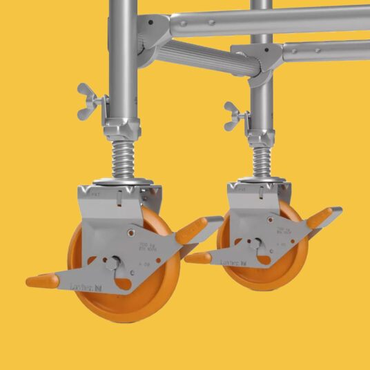
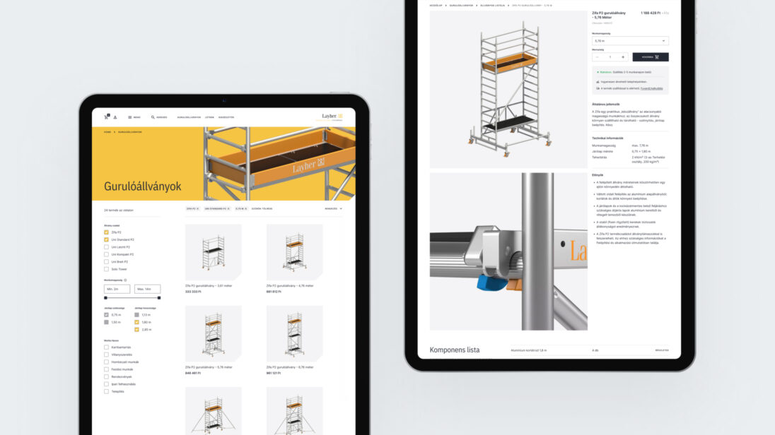
By the end of the project, we created a unique webshop with a visual atmosphere that aligns perfectly with the products. Throughout the purchasing and information-gathering processes, we considered it essential to provide active support to users. One of the primary reasons for this is that a significant portion of workers in the construction industry prefer using traditional communication channels (phone calls, face-to-face conversations) to handle procurement-related tasks, where immediate feedback is guaranteed. Additionally, rolling scaffolds are complex and expensive technical products, often requiring expert assistance and further consultation for proper configuration. Based on these factors, we integrated solutions into the webshop that facilitate two-way communication for customers, ensuring that the platform is easy to navigate and functional on mobile devices as well.
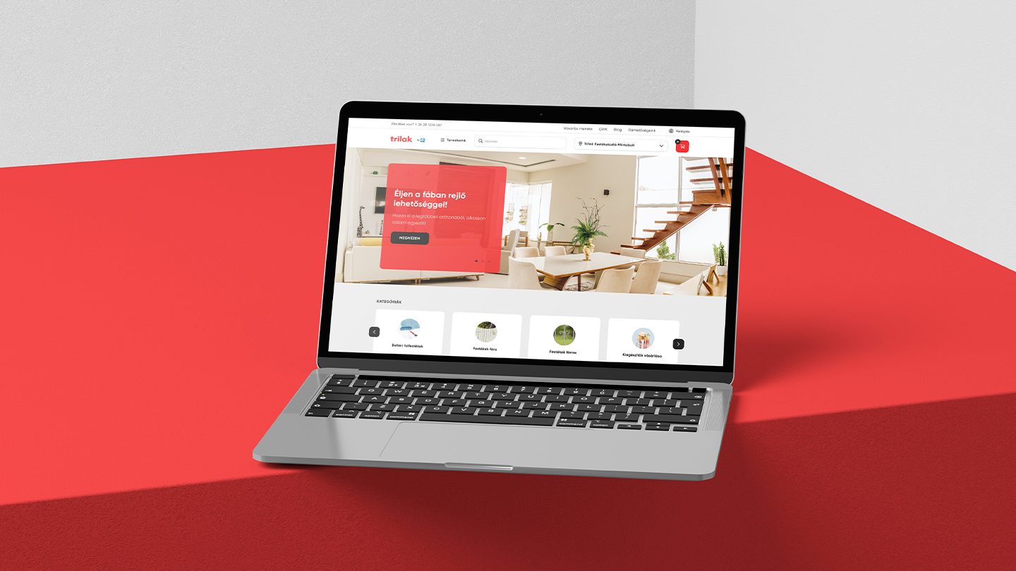


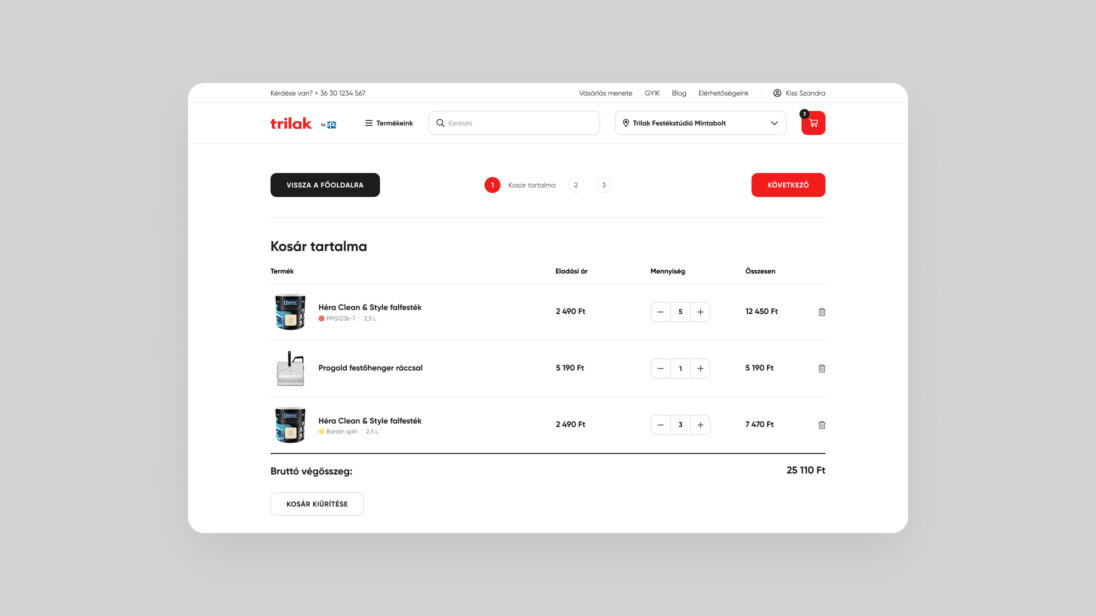
PPG Trilak, a paint manufacturer and distributor, was founded in 1907 in Budapest. The company, still a market leader in Hungary, operates as a subsidiary of PPG and exports about one-third of its production abroad.
Due to the rise of online shopping and the impact of the pandemic, the company decided to take its first decisive step toward electronic sales. They sought a solution that could be launched quickly and developed incrementally, fully meeting their sales vision.
The click & collect webshop best met our client’s expectations. We created a custom solution tailored to the unique characteristics of the franchise network and the complexity of the customer base.
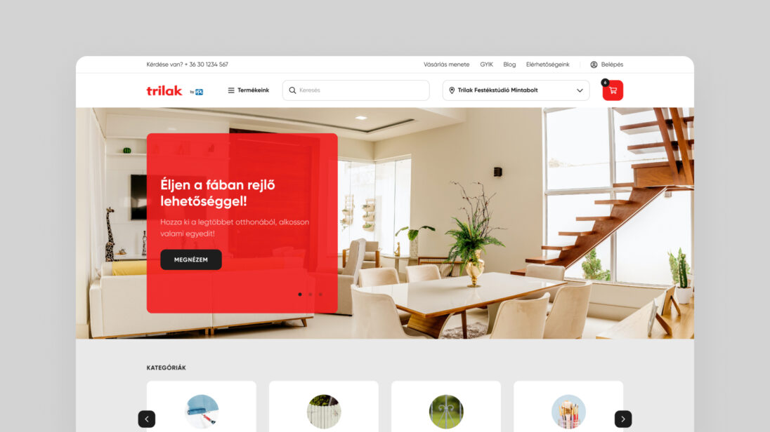
The complexity of the task lay in PPG Trilak’s diverse customer base, which includes both professional experts (B2B) and occasional home renovators (B2C). Creating an optimal customer experience for all target groups was a significant challenge, as we had to provide knowledgeable support for casual buyers while not hindering the product selection process for returning professionals.
A key goal was to ensure that all customers could quickly and easily find the right products with the appropriate level of support, without the different journeys interfering with each other. For example, frequent professional customers should not be slowed down by excessive guidance, while casual shoppers should receive comprehensive assistance and expert support, similar to what they would experience in stores. To support informed decisions, we conducted UX research to understand the real needs and behaviors of the client’s customer base.
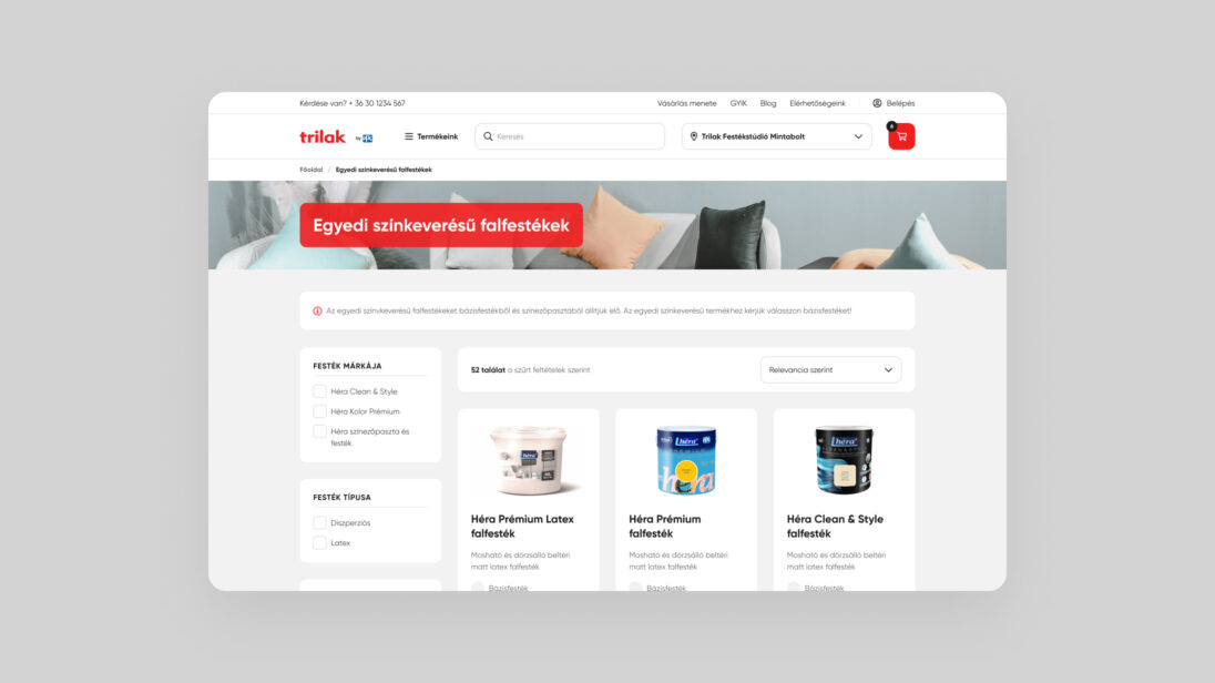
Various UX and UI design methods were employed during the project to understand the needs of the client and the different user groups.
We grouped the most important findings from the UX research by identified problem areas, then synthesized the results into wireframes based on significant insights. The problem areas included:
The click & collect solutions effectively showcase the product range, guide customers to stores, and promote products online, allowing conversions and transactions to be measured during online marketing campaigns. Another major challenge of the project was the franchise network’s unique characteristics, which had to be considered when designing the e-commerce solution.
Since there was no central, up-to-date system for the franchise partners’ inventory and operations, we expanded the admin functions to ensure quick and efficient handling of functions such as:
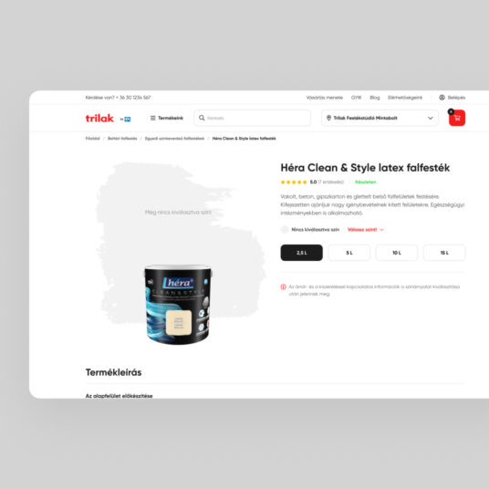
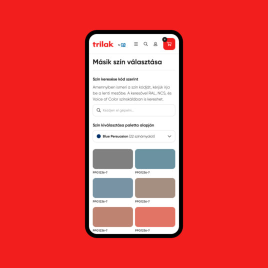
Based on initial feedback from franchise partners, a well-thought-out and carefully implemented solution was delivered, providing a solid foundation for the company’s future development plans and the gradual build-up of the digital sales channel.
