We are talking about a brand that is very well-known in Hungary — and far beyond its borders as well.
A Well-known Brand, A Complex Ecosystem
There are clients you have to explain, and there are those whose names speak for themselves. RTL clearly belongs to the latter category.
Working with a brand like this is both a privilege and a responsibility. Its digital presence is not merely a communication channel but a business-critical infrastructure: news sites, mobile applications, VOD platforms, live voting solutions, and advertising systems together form an ecosystem that serves hundreds of thousands of users daily — and, at peak moments, even several million.
People ask where you work. At Virgo. That doesn’t really mean much to them. Then you start listing it: we are the ones developing RTL, yes, the voting system too, and rtl.hu, and the app as well — and then they get it.
When Virgo won the tender in 2019 to redesign rtl.hu, it was clear from the very beginning that this would not be a classic redesign project. The task was to transform a live, business-critical system used on a daily basis, on tight deadlines and within an existing infrastructure. Although the brief primarily focused on design and frontend renewal, Virgo already approached the project as a brownfield development. The solutions had to fit into the existing system while remaining scalable and maintainable in the long term.
Project Goal: Creating a Hybrid News Platform
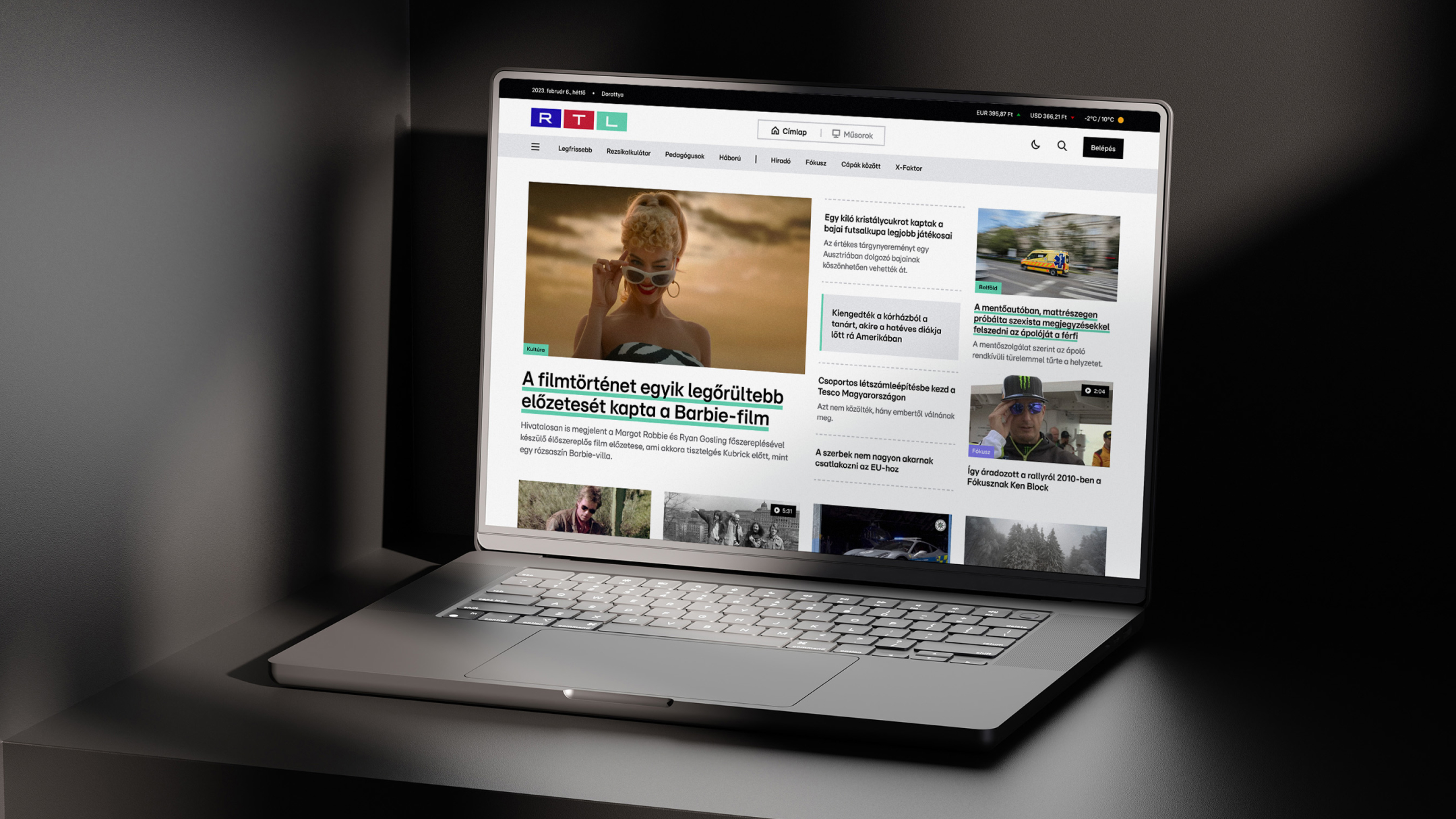
During the first project, the goal was to redesign rtl.hu, a platform built around a video-first mindset. In the second project, we were tasked with renewing the site’s functionality as well — basically, Virgo was asked to create a full-scale news site.
At first, they wanted to create a video-first website, sort of a cross between YouTube and a news site (…) so they would actually have a purpose for the platform, rather than just having a website simply because RTL needs one.
Virgo’s task extended far beyond refreshing the visual appearance. The team was responsible for designing the entire UX/UI concept as well as delivering both frontend and backend development, ensuring optimal performance across web and mobile platforms alike.
Challenges: Complexity and Live Environment
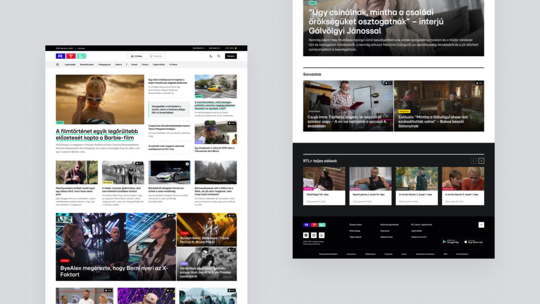
The greatest challenge was the integration of various content types. The platform had to simultaneously accommodate live TV broadcasts, show-videos and text-based news, while ensuring a unified and coherent user experience. We needed to develop UX solutions that supported the editorial team’s new operating model and ensured stable performance even under heavy traffic.
All of this took place during a period when, prior to the rebranding, the site had to remain recognizable and usable with temporary visual elements in place, while the forward-looking concept had already been defined.
Research and Planning: The Foundations of Joint Thinking
Virgo began the work with UX research to uncover editorial, business, and user needs. In-depth interviews were conducted with leaders from various areas of RTL to understand the future model of content creation, monetization expectations, and operational challenges.
Mapping user journeys helped reveal how visitors navigate the site, what types of content they consume, and where it makes sense to encourage further content consumption. The homepage, the article pages, and the show pages went through multiple iterations, with continuous alignment with the RTL team to harmonize business, editorial, and technological considerations.
Design and Visual System
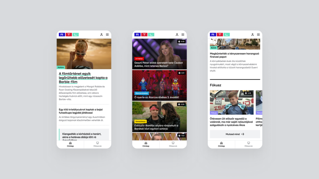
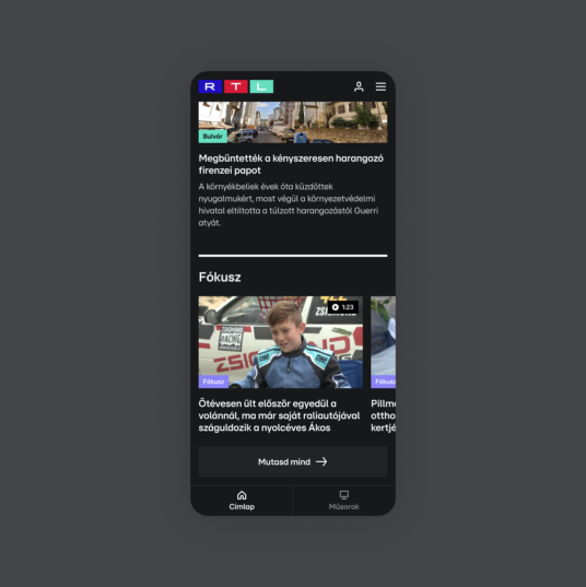
The visual concept was built on a long-term, sustainable, and extensible design system. The work started with mood boards and the definition of visual directions, resulting in a UI direction that paved the way for the rebranding, while temporary visual elements ensured recognizability during the transition period.
The design system provided a unified approach to colors, typography, grids, and components, laying the foundation for future platform expansions and adaptation to other digital surfaces.


Technology: Performance and Scalability
Virgo built a modern, Vue.js 3–based single-page application with server-side rendering to ensure SEO and performance. Dynamic content was delivered via REST APIs, and the system was integrated with external authentication and push notification solutions. The development approach was cross-platform, enabling web and mobile applications to be developed in parallel in a cost-efficient manner.
A Deepening Partnership
Following the successful launch, the collaboration quickly expanded. More and more tenders followed, now affecting not only the website but the entire digital presence: reimagining design systems, developing the news portal, mobile applications, VOD-related solutions, and campaign sites.
In the meantime, a completely custom homepage editor was created behind rtl.hu, integrated directly into the existing CMS. This tool allowed editors a high degree of freedom in shaping the homepage, while the technical framework ensured consistency and stability.
The editors were given a tool with which they could solve almost anything on the homepage.
The collaboration did not operate on a project-by-project basis but through continuous support. New needs, new content and business goals emerged, to which Virgo responded quickly and as a partner. During this period, Virgo’s role went far beyond classic development tasks. The team maintained a constant presence: supporting, maintaining, and thinking together with RTL’s digital team about new requirements, business objectives, and content directions.
Live Shows: The Real Test of the System
One of the biggest challenges of the collaboration was the digital voting systems connected to live shows. Voting for X-Factor and other entertainment programmes generated traffic spikes that are difficult to prepare for using traditional planning methods. As a result, the mobile application and voting system associated with X-Factor was not only a development challenge but also an operational one.
What surprised me the most is how much power TV still holds today. When the host says live on air that everyone should take out their phones and go to the RTL mobile app, and suddenly ten thousand users arrive — that’s not easy to handle.
Scalability, stability, and the legal environment (studio, notary, live production) all came into play at the same time. Virgo’s team was present at RTL’s headquarters during live broadcasts, working closely with operations and production teams. The first live vote that ran stably was a major milestone: confirmation that the architecture, operations, and collaboration all performed well in a live environment.

Design and Development in a Shared System
The RTL-project was a defining milestone for Virgo from an internal perspective as well. This was where the operating model truly matured — one in which design and development are not sequential steps but parts of a single, shared thinking process.
We were literally sitting next to each other: while designing, we were already thinking about how it would be developed — and vice versa.
Component-based design, shared prototyping, and immediate technical feedback made it possible for planned solutions to take development, maintenance, and scalability considerations into account from the very moment they were created.
We knew that what we designed, we would also be able to develop.
This confidence defined the project from start to finish and later became one of Virgo’s core strengths in other collaborations as well.
Partnership in Everyday Work
They trust us with new projects, new technologies, and new requirements they want to realize — that is very clear feedback for me.
Over the years, the relationship gradually evolved from a client–vendor setup into a genuine partnership. New projects, shared decisions, and mutual trust all reinforced this transformation. Trust was built step by step, but at a certain point it became clear:
Changes in scope, tight deadlines, and the need to align the interests of many stakeholders at RTL did not become sources of conflict, but shared challenges. The challenges did not disappear, they became manageable through open communication, joint decision-making, and sometimes even informal conversations. The focus was always on maintaining balance between business goals, content, and user experience.
Impact on Virgo’s operations
The RTL-project became more than just a key reference for Virgo. It served as a milestone for the company’s evolution. It reinforced the strategic role of design and the integrated operation of design and development, helping Virgo position itself not merely as a development shop, but as a provider of complex digital solutions. The methodologies developed during this collaboration — especially the close cooperation between design and development — have continued to shape the company’s operations ever since. As the team put it: they grew not only professionally but also became more adaptable on a personal level.

Summary
The shared story of Virgo and RTL clearly demonstrates how a successful tender can evolve into a long-term digital partnership. This collaboration is not the story of a closed project, but that of a continuously evolving digital ecosystem that simultaneously shapes the operations of a nationwide media brand and the professional identity of a digital agency. The story highlights that digital success is not only about technology, but also about trust, shared thinking, and adapting together to challenges.
Our work
Hungary’s #1 webshop. Grand Star winner. Built by Virgo.
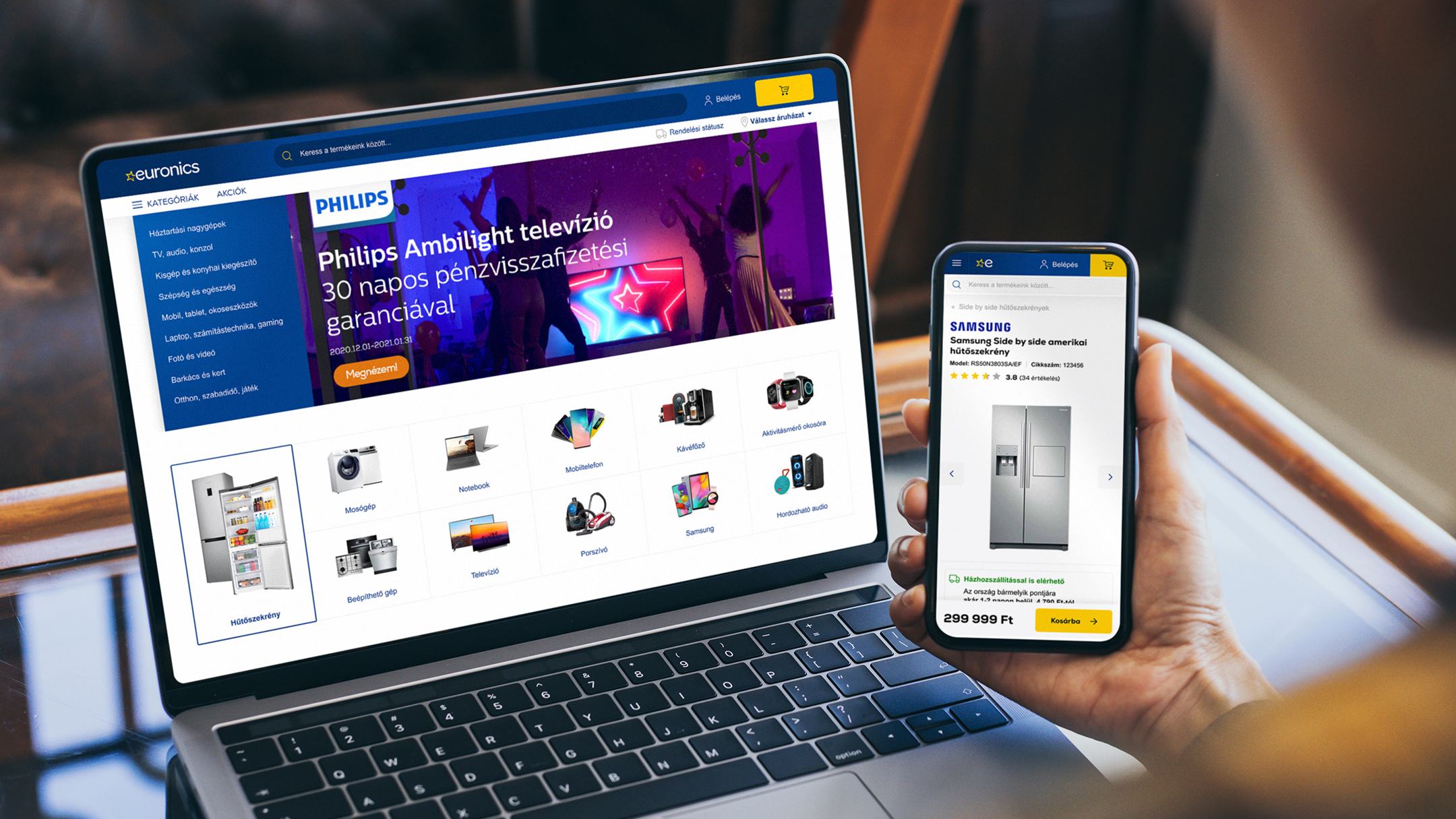
Euronics’ renewed webshop won the Grand Star at the HungarEcomm Stars 2024 Awards and, for the third year in a row, is the highest-grossing 100% Hungarian-owned e-commerce site. The large-scale project was led by Virgo, and we have plenty to share about it. Take a look behind the scenes of a true success story!
It was like replacing the engine of a speeding car — it took meticulous preparation, detailed planning, early-stage migration, and a seamless handover.

Project Goals
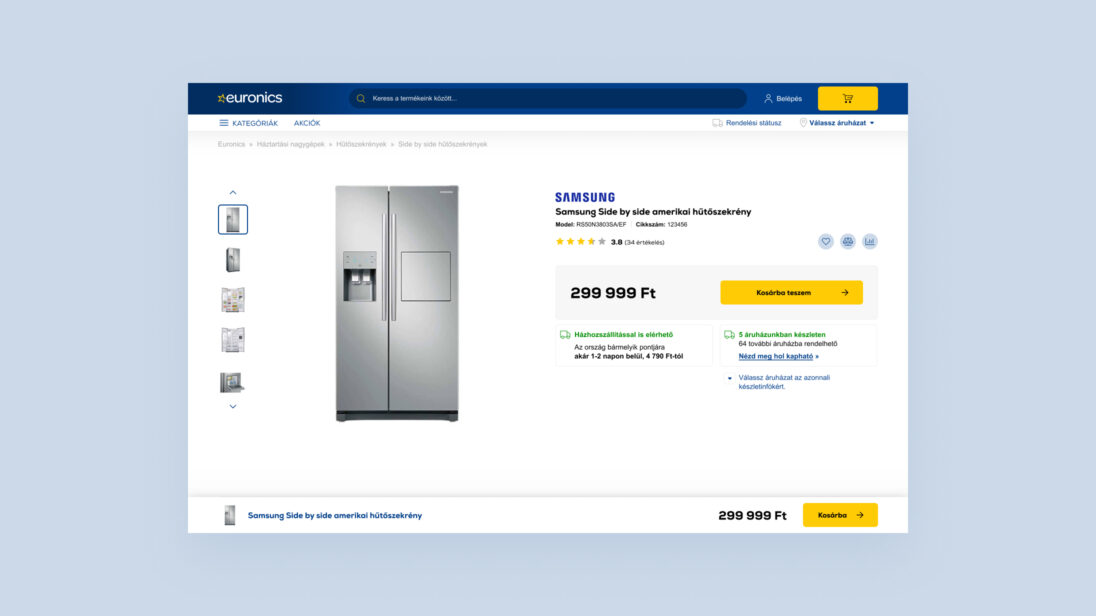
We began collaborating with the Euronics team in 2020 to develop their new webshop. Beyond technological upgrades, we completely redesigned the user experience and visual appearance. Our main objective was to increase webshop traffic, which we achieved using modern development tools, the implementation of new backend processes, and the creation of user journeys aimed at improving conversion rates.
Challenges
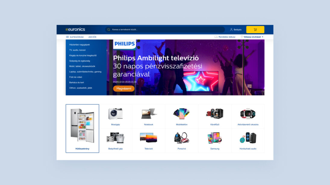
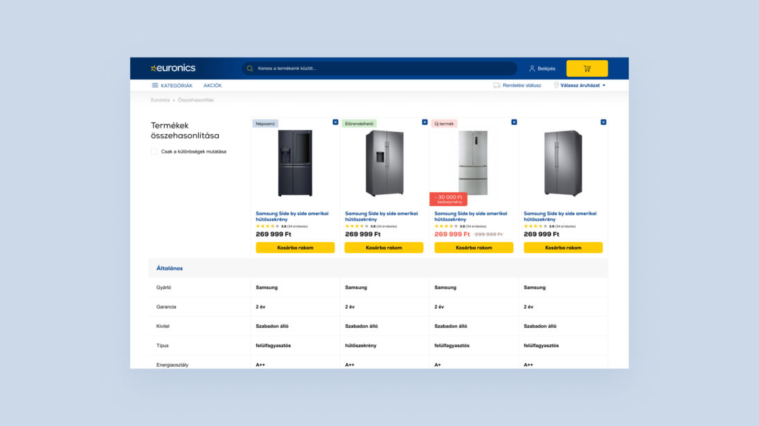
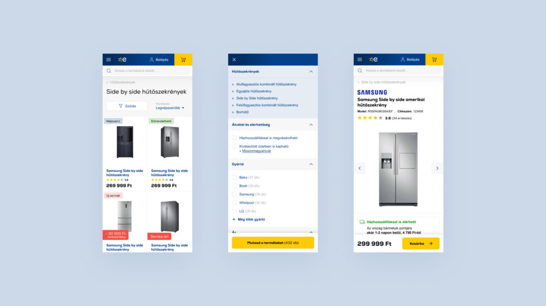
Redesigning the Euronics webshop came with several complex challenges. Our goal was to create a modern, user-friendly platform that not only provides an outstanding shopping experience but can also manage complex product categories and a catalogue of tens of thousands of products. We had to harmonize clarity, fast navigation, and visual appeal while ensuring the webshop worked smoothly across all devices. Responsive design, fast page loading, and the integration of both online and offline shopping needs were key to success.
From a technological standpoint, one of the biggest challenges was integrating both existing and new third-party systems and ensuring seamless data flow. We placed particular emphasis on establishing effective communication channels with various partners to identify bottlenecks and collaboratively develop targeted, long-term solutions.
Our team’s strength lies in our ability to quickly respond to changes, adapt flexibly to new situations, and ensure that no tasks “fall through the cracks.” We actively support the coordination of different departments and vendors, maintaining an end-to-end view of the process instead of focusing only on isolated programs or tasks. We strive for solutions that holistically support the client’s business goals.
Thanks to our market experience, we stay up to date with trends, understand the opportunities, pitfalls, and challenges. We don’t just deliver software—we stay by our clients’ side long term: operating, fine-tuning, and continuously improving systems to maximize their value. For us, success means establishing and maintaining stable, long-term partnerships with our clients.
Design and Development Process
1. Research and Analysis
We kicked off the project with thorough research to assess both client and user expectations and needs regarding the webshop.
- Desk Research
We gathered all the necessary documents, data, and information from the client and users to understand pain points and strengths. We also analyzed the market and competitors. - Stakeholder Interviews
We conducted in-depth interviews with leaders and experts from various departments of Euronics to understand their business goals and future plans for the webshop. - Usability Tests
We tested the old website with users who had experience using Euronics or competitor webshops. These tests provided valuable insights we later applied in designing the interfaces and processes. - Baseline Research
Alongside usability aspects, we also examined quantitative data—primarily web analytics. Using web analytics and clickmap tools, we identified strengths and weaknesses of the site and gained deeper insights into user behavior. - Tree Test
Using the tree map testing method, we evaluated the findability of subpages from the users’ perspective. Participants were asked to locate specific pages within a modeled menu structure, and the software tracked their paths and success rates. - Journey Map
In a workshop with the client, we mapped the most important user journeys that required deeper understanding of user behavior.
2. UX Design
- Information Architecture
We mapped the highly complex navigation and information structure of the site to make it as digestible as possible during the redesign. - Wireframes
After collecting sufficient information about key pages and functionalities, we created wireframes for the most important screens and processes.
3. Concept and UI Design
- Concept
Once the wireframes were finalized, we created the digital visual identity and design concepts tailored to the Euronics brand. We conducted benchmarking research to form a new UI concept, which illustrated the visual direction across selected key pages. - UI Design
We designed all pages in pixel-perfect detail, prioritizing them based on their importance, in both desktop and mobile views. - UI Kit and Style Guide
As page design progressed, we continuously expanded the UI Kit. Once the designs were approved, we delivered a component library that enabled the easy creation of new pages with design support. The Style Guide documented all digital brand identity elements.
4. Frontend Development
The frontend was developed using a responsive approach, based on Bootstrap, using jQuery and Stencil.js.
5. Backend Development
- Application
Developed in PHP using standard tech stacks. - Autonomous Mode
Can operate independently from other IT systems if needed, ensuring uninterrupted shopping experiences for users. - System Integration
Continuous coordination with over 30 external providers, including SAP, Emarsys, and the POS system. - Server
Hosted on AWS, with architecture optimized for rapid and efficient scaling during peak periods (e.g. Black Friday). - Parallelization
The development environment was set up to allow multiple teams to develop features simultaneously. - Deployment
Can be deployed multiple times a day without webshop downtime, essentially with a single click. - Automated Testing
Selenium and Playwright tests run continuously to ensure quality assurance. - Security
The system is continuously audited and updated to meet current standards and expectations.
Results and Outcomes
In recent years, Euronics’ digital developments have not only brought technological advancements but also delivered tangible business results. Between 2018 and 2021, the share of online sales more than doubled, a growth further accelerated by the pandemic. Within just four years, the company moved from 12th to 6th place on the GKI Digital ranking of Hungary’s highest-grossing online retailers. In 2022, it was once again named the largest 100% Hungarian-owned online retailer.
At the heart of this success was a clear goal: to provide the best possible customer experience in the digital space. When redesigning the webshop, Euronics aligned its platform with the latest consumer trends. The search logic was restructured to help users find products and brand pages more efficiently.
The checkout process was streamlined, guest checkout was made seamless, and personalized product recommendations were further refined. Flexible delivery time slots were also introduced to better fit customers’ schedules.
Equally important was choosing a webshop engine capable of handling increasing traffic loads with speed and stability—ensuring smooth performance even during peak periods.
These achievements clearly demonstrate that when customer experience is prioritized, business success follows naturally. Euronics can be proud of the progress made and grateful to everyone who contributed to this outstanding project.
Customer Voices on the New Euronics Webshop
I ordered online — choosing and placing the order was super easy thanks to a really user-friendly interface. Delivery was fast, but unfortunately the product didn’t work out for me. That’s when it really helped that there was a store nearby where the return process was smooth and hassle-free.
I always buy my devices and gadgets here — it’s a no-brainer for me. The webshop works great: easy to search, order, and pay. The email notifications are clear and to the point, so I never have to worry about the status of my order. Plus, the prices are really good, especially considering they also have physical stores. There was even a time when I ordered something online, but happened to be near a store the next day — I popped in, they had it in stock, and I was able to pick it up right away. They were super flexible about it.
- Research
- UX Design
- UI Design
- Design System
- Front-end development
- Back-end development
- AWS architecture
- Maintenance and operations
- Responsive Design
- Application Design
- Design System
- Virgo Corbis B2C modul
- Front-end
- CMS
Our work
- UX Research
- User Research
- UX Design
- UI Design
- Prototyping
- User Testing
- Interface Design
- Prototype
- Content Optimization
Project Goals
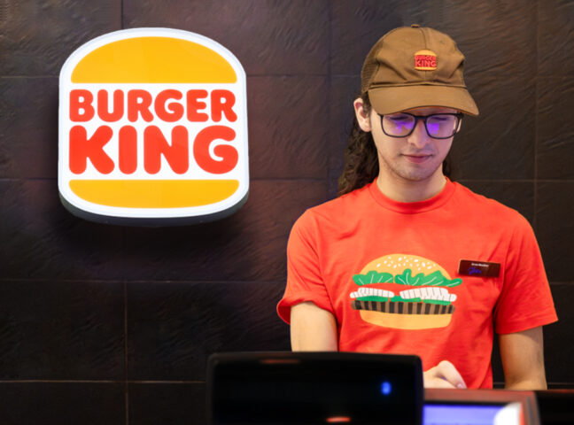
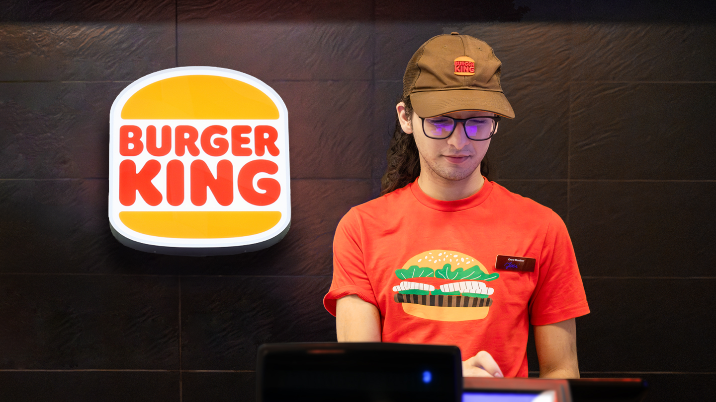
Burger King Hungary aimed to modernize their cash register system to better align with current operational demands, reducing inefficiencies in the order-taking and service process. The redesigned system also needed to accommodate different restaurant types (drive-in, food court, etc.), ensuring adaptability across various environments.
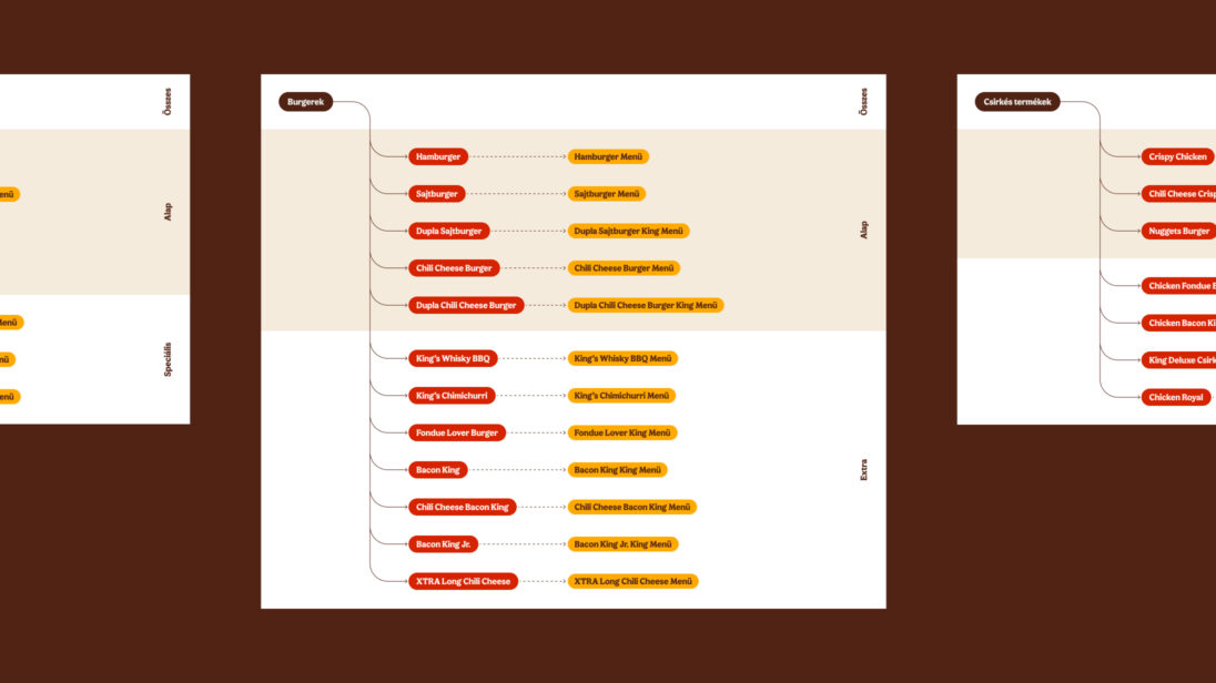
Challenges
One of the major challenges was integrating the new system into the existing workflow, ensuring that long-term staff could transition smoothly. Additionally, the system needed to handle different restaurant operations while optimizing the order-taking process for faster service. The increasing role of digital channels (self-service kiosks, mobile apps, and delivery services) added complexity, requiring the system to integrate these elements seamlessly.
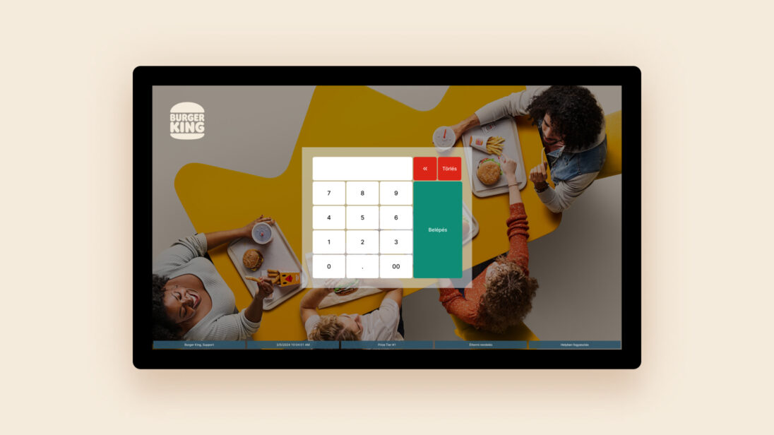
Design Process
1. Research & Analysis
The first step of the design process was UX research, during which we thoroughly examined how employees use the cash register system in a real restaurant environment and how it fits into the daily restaurant operations.
- Stakeholder Interviews
Conducted with restaurant managers and cashiers to understand their pain points and operational challenges. - User Interviews
Conducted with employees from different types of restaurants (drive-in, downtown, mall food courts) to map out the unique challenges of each location and understand how these influence the use of the cash register system. - Usability Testing
Observing staff interactions with the current system to identify areas for improvement. - Field Research
Observing real-time use of the cash system during peak hours, identifying inefficiencies.
2. Design and Prototyping
Our main goal during the design process was to improve the system’s clarity and usability.
- Navigation Optimization
Simplifying navigation and removing outdated functions to streamline the user interface. - Order Process Optimization
Redesigning the flow for faster, easier order processing. - UX and Copywriting Optimization
Improving text clarity and consistency. - UI Optimization
Organizing visual elements (color codes, icons) for easier recognition and functionality.
Our goal was to ensure that the new cash register system seamlessly fits into the employees’ established processes while simplifying order-taking.

Our work
- Research
- UX Design
- UI Design
- Design System
- Responsive Design
- Application Design
- Design System
Project Goals
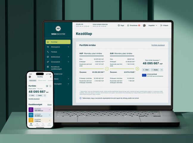
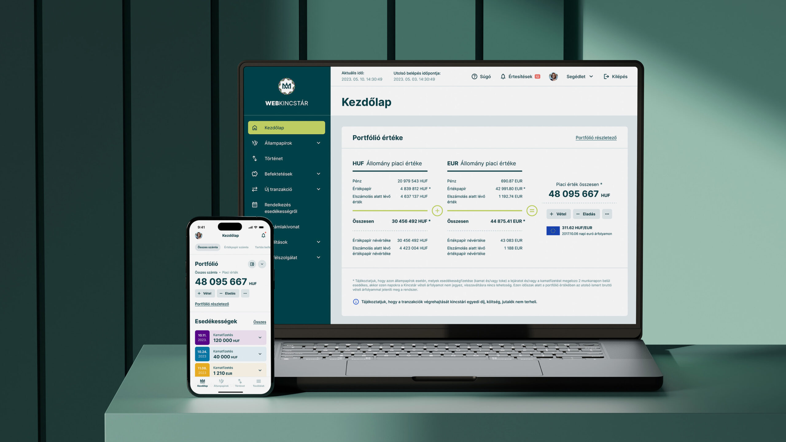
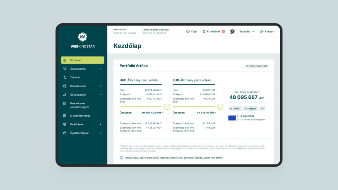
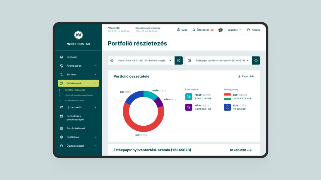
Dorsum approached us with the goal of renewing the visual appearance of the Hungarian State Treasury’s online distribution channels – Webkincstár and Mobilkincstár – and redesigning certain user interfaces to improve the customer experience.
One of the most important objectives in the system renewal was to make the products more appealing to younger generations, while ensuring that the current users would not experience any discomfort in their use. Additionally, a fundamental requirement was to ensure that the updated interfaces would reach as many users as possible, so we paid special attention to complying with accessibility guidelines.
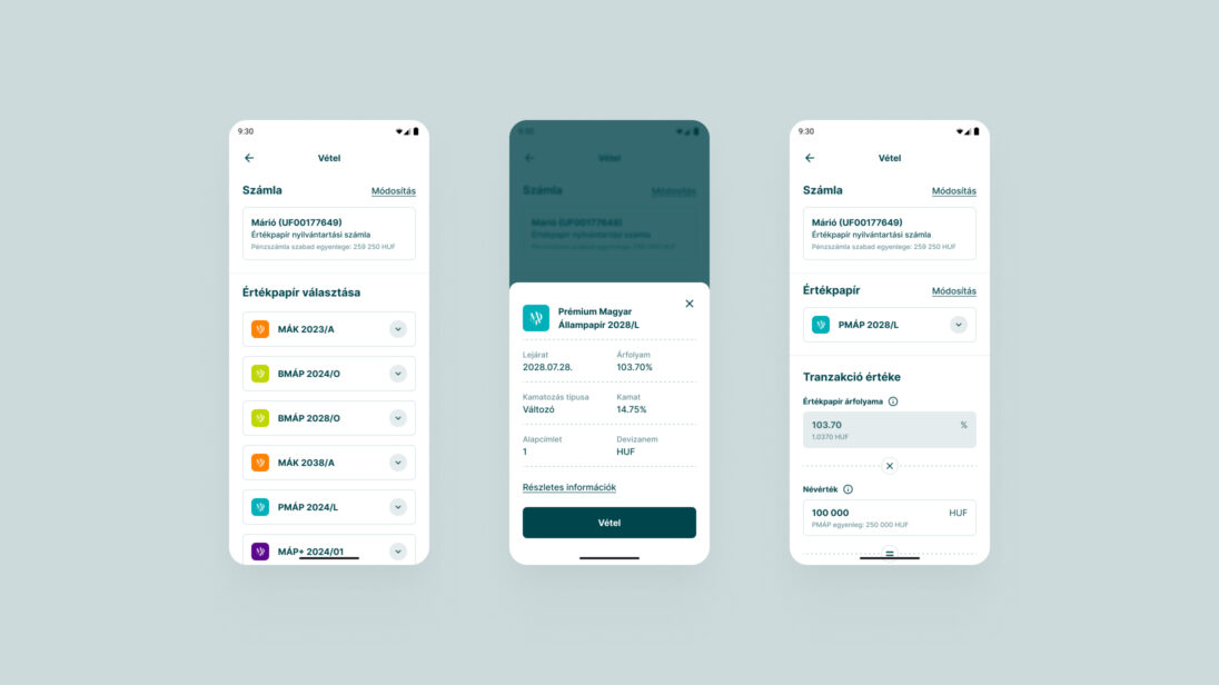
It was crucial that the visual renewal enhance the user experience with modern UI solutions, particularly for mobile applications (iOS, Android).
Challenges
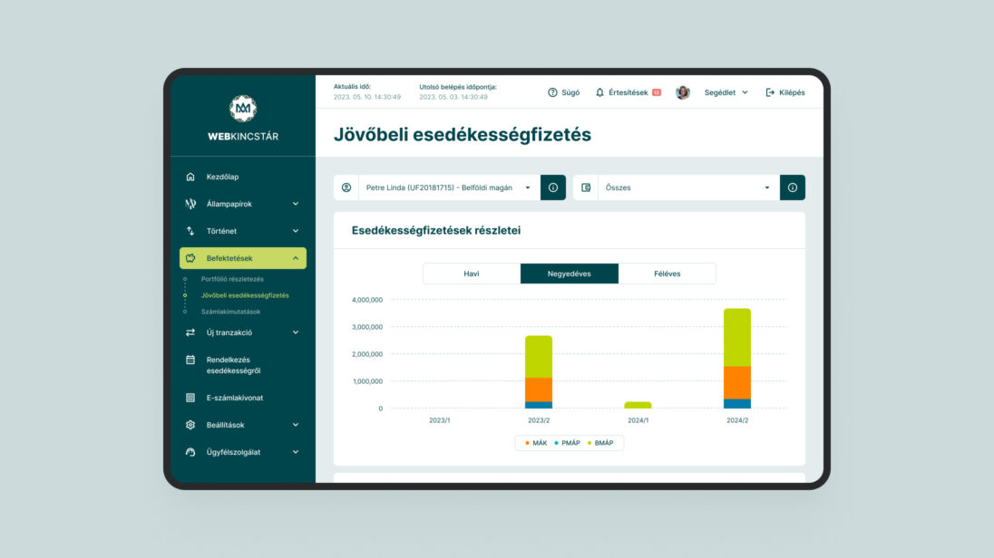
One of the biggest challenges was designing an interface that meets the needs of different user groups. The younger generation requires intuitive and modern solutions, while older users value a familiar structure and simplicity of use. Additionally, the digital interfaces had to comply with accessibility regulations.

Design Process
During the project, we applied various UX and UI design methods to understand the needs of the client and the users.
1. Research & Analysis
- Stakeholder Interviews
Conducted with Magyar Államkincstár to understand their business goals and challenges. - Usability Testing
Focused on different age groups to identify pain points in the current system. - User Journey Mapping
Mapped user interactions to design smoother workflows.
2. Design and Prototyping
Optimized Core Functions: Key processes such as registration, transaction handling, and portfolio management were streamlined to improve the user experience.
3. Design System Creation
A consistent design system was developed, based on Magyar Államkincstár’s visual guidelines, integrating modern UI elements.

Results and Outcomes
- Consistent UX Across Devices
A responsive design approach ensured a seamless experience across desktop, mobile, and tablet devices. - Improved Accessibility
Adhering to accessibility standards made the platform usable by a broader audience. - Enhanced User Interface
Modernized, user-friendly design that meets the needs of both younger and older generations. - Efficient Transaction Handling
Streamlined workflows for improved usability and faster transaction processes.
The biggest challenge was redesigning the interface to meet the needs of both younger users, who prefer modern, intuitive solutions, and older users, who value simplicity and familiarity. All of this while ensuring the platform adheres to accessibility standards.

Our work

- Research
- UX Design
- UI Design
- Design System
- Front-end development
- Back-end development
- Responsive design
- Application Design
- Design System
- Front-end
- CMS
- PWA application
Project Goal
Virgo Systems partnered with RTL Hungary to redesign their digital platform, transitioning from a video-first website, (which was also designed by Virgo Systems in 2019) into a comprehensive news portal. This project involved an overhaul of UX/UI design, integrating both text and video content for an engaging user experience. The redesign was supported by Virgo’s front-end and back-end development, ensuring optimal performance across web and mobile platforms.
RTL Hungary sought to transform their existing video-centric platform into a comprehensive news portal. The challenge was to combine video content with more text-based articles, ensuring that both forms of content complement each other and drive engagement. The goal was to integrate RTL’s news articles, TV shows, and promotional content into a single, coherent digital experience.


Challenges
We encountered several challenges that made this project unique.
We had to design a news portal with a unique structure, which included space for TV broadcasts, show videos, and promotional content. This duality had to be unified in a way that, alongside the video content, much more text-based content and articles would be visible. According to the concept, on the new portal, different types of content had to complement each other — meaning that text-based content should have related video content, and video content should also be accompanied by text.
The biggest challenge was rethinking and designing the user experience, where we had to channel various ideas and concepts within the newly forming editorial team into implementable solutions.
Even before the brand rebranding, we sought visual solutions that would support and make the future interface easy to use. We also had to design a temporary rtl.hu logo to ensure the news portal remained easily recognizable during the transition period.


Design Process
1. Research & Analysis
As the first step in the process, we began with UX research, during which we thoroughly assessed the needs of both the client and the users.
- Stakeholder Interviews
We conducted in-depth interviews with leaders and experts from various departments of RTL Hungary to understand the business goals and future visions for how content production would work. - User journey Map
We mapped out potential user journeys to gain a deeper understanding of user behavior and content consumption habits.
2. UX Design
- Information Architecture
We carefully considered how the site could structurally serve the various content of news and shows, ensuring that users could easily and clearly find what they were looking for, while also promoting further content consumption. - Wireframes
We created wireframes for the key pages (homepage, article page, show page) and discussed any questions or modification requests based on the designs. At this stage, it was still easy and quick to make changes to the concepts. - Banner Strategy
Since a significant portion of the site’s revenue came from ad displays, we worked extensively on placing the banners in optimal locations and sizes. We aimed to create a balance that would generate the expected revenue without compromising the user experience.
3. Concept and UI Design
- Concept
To find the exact vision for the visual direction, we first gathered UI mood boards, which we reviewed and expanded with the client. Based on the chosen style, a concept was created that laid the foundation for the visual direction of the UI designs.
UI Design
We designed every page in both desktop and mobile views, following a defined priority order. - Design System
First, we established the basics: colors, typography, grid, spacing, etc. Then, we continuously expanded and documented the new component library.
4. Frontend Development
- We developed a single-page application based on Vue.js 3, in line with modern expectations, with server-side rendering (SSR) support due to the importance of SEO and performance.
- The dynamic content was integrated via a REST API, alongside third-party authentication systems and push notification services.
- The codebase was developed with a cross-platform mindset, ensuring that the development of the iOS and Android mobile apps remained cost-efficient in parallel with the web system.


Our work
- Research
- UX Design
- UI Design
- Design System
- WooCommerce webshop
- Responsive Design
- Design System
Project Goal
The client aimed to start online sales for three product categories:
- mobile scaffolding,
- ladders,
- and scaffolding parts.
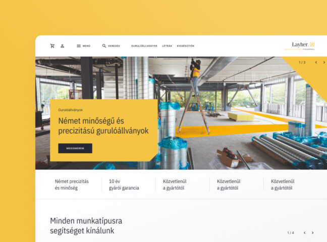
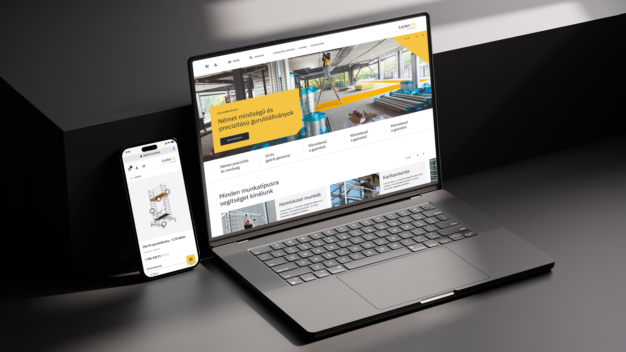
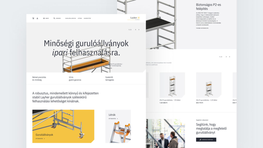
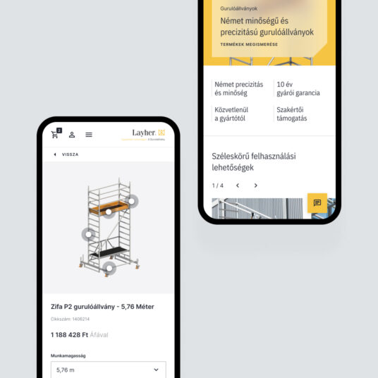
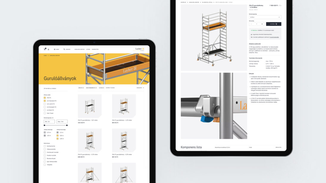
The goal was to create a webshop that adheres to professional standards, showcasing the different types of scaffolding and the configuration options related to them. The finished website did not need to closely follow Layher’s current branding; it was far more important that it reflected the premium quality that Layher products represent.
Challenges
One of the main motivating factors for creating the new webshop was to bring more focus to the mobile scaffolding product category in sales. While Layher is the market leader in building scaffolding in Hungary, it is not in mobile scaffolding. This is due not only to strong competition but also to a market characteristic: the Hungarian market is extremely price-sensitive, and Layher’s products are positioned at a higher price point. Therefore, we designed a user journey for the webshop that best serves this multi-step introduction process for customers.
Layher stands out from its competitors in terms of expertise and customer support related to its products, so it was essential to highlight the option for personal assistance for customers within the webshop. In the construction industry, customers appreciate personal communication and often visit the company and check the showroom before making a purchase. Therefore, the webshop emphasized the possibility of personal assistance, maintaining a balance between communication options (phone consultation, chat) and online purchasing.
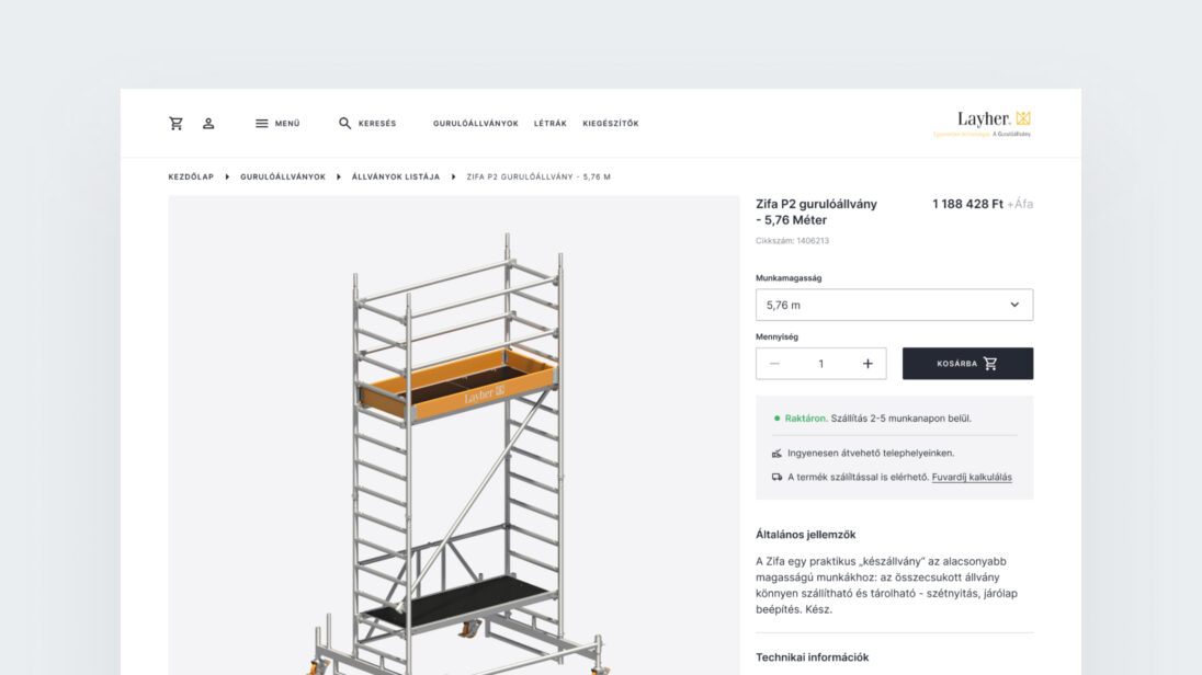
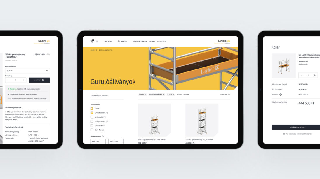
Another challenge was solving the delivery issue, as the products are oversized and heavy, making it difficult to calculate the delivery cost. However, from the end user’s perspective, knowing the delivery fee is important so that they can decide whether in-store pickup or home delivery is more cost-effective before completing the purchase. To address this, we created a shipping cost calculator that calculates the delivery cost for the customer based on product attributes and postal code.
Design Process
1. Delivery Strategy and Team Setup
In the initial phase of the design process, we uncovered the client’s motivations behind the need for a digital product. Afterward, we built prototypes from wireframes to validate our solutions. Following this, we constructed the webshop’s elements based on an approved UI concept and compiled them into a UI kit.
2. Research and Analysis
- Stakeholder Interviews
We conducted in-depth interviews with key individuals and experts from the company to understand any potential pain points and to gain a detailed understanding of the business model and goals behind the creation of the new webshop. - User Interviews
In addition to decision-makers, we spoke with the company’s customers, discussing their purchasing habits, preferred communication channels (and why they favor those channels), and the importance of expert advice. - User Story Map
We created a detailed user story map outlining the key functions needed for the future operation of the webshop.
3. UX and UI Design
- UX Design
Based on the information gathered, we created a detailed sitemap for the webshop and designed the connection points between Layher.hu and the new webshop. Using personas, we established possible user journeys. We reviewed customer requirements based on detailed wireframes and incorporated the results of iterations into the plans. The results were tested through prototypes. - UI Design
We created a fresh and modern visual identity for the webshop in line with Layher’s branding, paying special attention to ensuring that functions like the shipping cost calculator or product selection assistant were easy to use and understandable on all screen sizes.
Results and Outcomes
By the end of the project, we created a unique webshop with a visual atmosphere that aligns perfectly with the products. Throughout the purchasing and information-gathering processes, we considered it essential to provide active support to users. One of the primary reasons for this is that a significant portion of workers in the construction industry prefer using traditional communication channels (phone calls, face-to-face conversations) to handle procurement-related tasks, where immediate feedback is guaranteed. Additionally, rolling scaffolds are complex and expensive technical products, often requiring expert assistance and further consultation for proper configuration. Based on these factors, we integrated solutions into the webshop that facilitate two-way communication for customers, ensuring that the platform is easy to navigate and functional on mobile devices as well.
